Thursday 30 June 2016

Taobao Haul June 2016- Picture Heavy

It's time for another Taobao review! I needed a bolero for a wedding anyway, so I decided to stock up on some new accessories whilst I was at it. Despite indicating that I was going back to using Taobao Spree, I did end up using Taobao Ring again. My thinking was that there wasn't really much that could go wrong with the packaging and what I was ordering. I was considering trying Buynosaur, but after hearing some negative stories I have decided against using them. Taobao Ring actually did quite a good job with this order and Monica was very helpful when one of my items was taking longer than expected.


And today's mystery packaging is... a load of foam and a few sheets of newspaper! To be fair, it was packaged quite securely and this packaging is an improvement over the random nappy bag I got with one of my previous orders. Most of my accessories were put inside the bag I ordered. The only slight issue was that one of the corners of the bag got slightly bent, but thankfully that seems to have sorted itself out with no long-term damage.


First up today is this bag from Loris. Loris has not always had the best of reputations in the lolita community. Am I the only one who recalls the infamous EGL post where they posted a video of them placing a brick in their bag and swinging it about in response to their negative reviews? This Loris bag seemed to be exactly what I was looking for, so I decided to risk it, seeing as it was a fair price. I can confirm that I am really happy with the finish on this bag. It is a really nice shade of gold and I can't find any faults with it. After giving this bag a thorough examination, I can't see this bag breaking unless you seriously overload it. I wouldn't say the quality is on the same level as the Japanese brands, but it isn't a great deal different. 


Here is the slight mis-shaping caused by the packing that I mentioned above. I have thankfully managed to un-dent the bag and luckily it was just this one corner.


The charm on the zip pull is a star shape and pretty similar to those you see used by Angelic Pretty.


I don't know if you can see it that clearly, but there was one small loose thread. The stitching was otherwise very neatly done and I couldn't spot any other flaws.

Size-wise, it is similar to many lolita bags. It is big enough to hold the essentials and possibly a few small bits as well. There is a zip pocket inside as well, which is useful. The only thing I would say (and the same thing happened the last time I got a bag from Taobao, but a different store) is that there was a slight smell inside the bag. The smell wasn't as strong this time (last time it smelt like fish that was a day or so past its best and it actually made me gag) but I am still going to have to give this bag a proper airing and de-odourising before I can properly use it. Despite this setback, the bag is actually better than I was expecting. Once I get the smell out, I expect I will be using this bag a lot. So I wouldn't say Loris was completely perfect, but from this experience I would say I was pleased with what I got.


Next we have these Rain House earrings. Taobao Ring warned me that the boleros I got may take 14 days, but surprisingly it was these earrings that held up the order. One thing Ring did tell me though, was that the gold pair may have defects to them, although I am yet to find anything wrong with them. I liked that the earrings came in a proper box and each pair of earrings came in a small bag so that they didn't get tangled up. You can even see that I got given a free pair of neon pink star shaped earrings, but they are not really my colour! 


The earrings have a really pretty design to them. I love the dangling charms and the moon has a cute design. The only thing I would change about them, is I would have liked the moon on the other earring to face the other way, so that both moons face the same direction when worn (hope that makes sense!). I will admit that after a few hours of wear, my ear did go slightly green. I suppose you have to expect that with cheap jewellery though and at least there are ways to prevent the green from coming back. I would consider ordering from Rain House again, but I will be keeping in mind that they took their time. After looking at how simple the earring design was, I was amazed that they held up my order for well over a week.


I also got another of these cuffs from Red Maria. After last time where my 'vanilla' cuffs turned out to be more of a mushroom grey colour, I decided to get a pair of 'generation' cuffs. Well, I say a pair, but halfway through my order Red Maria decided they only had one available. Taobao Ring made a note on my order, but didn't email me to let me know, so I only found out when I logged in to check my order progress. Weirdly, I looked at the item page just now and generation is available again. Maybe I will try and order another cuff, so I have a pair. I usually like Red Maria, but this situation with the cuff has been frustrating. On a more positive note, the generation colour is a lovely ivory, slightly yellow shade. If I am able to get another cuff I think they will make a nice pair of wrist cuffs. I appreciate these are meant to be bracelets, not wrist cuffs, but I think wearing just the one cuff looks weird.


Next up is this ring from Cutie Creator. My initial reaction was "holy f**k, that ring is massive" and I wondered how on earth I hadn't noticed the large size when I ordered it. I don't think this photo really captures just how massive it is.


Then I tried the ring on, and I realised just how heavy the ring is too. In fact, I can't see me realistically wearing this ring for long periods of time. Something else which is not that obvious in the item photo is the strange use of lace on the base. The shape and design of the lace does not really fit in with the strawberry and cream theme. It reminds me a bit of butterfly wings. Aside from being way too big and heavy, the strawberry looks really nice. The whipped cream at the base is very basic though. It is the same stuff you find in some deco-den kits. It feels soft to touch and I am amazed it is supporting the strawberry at all.


The base of the ring has a nice design to it and I like that the size is adjustable too. Sadly, I think I wont be buying from Cutie Creator for a while. I have not been that impressed with anything I have gotten from them recently, and this massive ring just confirms my fears.


My quest for the perfect sheer gloves lead me to Haruhi Clover. When I initially opened the packet, I was pleased. The material used feels so soft. The bows are massive though. They need to be about half their size and I do worry the bows are going to get in the way when I wear them. I am pleased that Haruhi Clover did seal the ends of the ribbons though, and the bows do have a cute, well formed shape.


I then started to notice a few problems with the gloves. My first concern is the wrist elastic. It is so thin and you have to be really careful putting the gloves on, or it will snap. Elastic this thin and flimsy is not acceptable. I am just glad that the gloves were not that expensive. I have had some really good quality items from Haruhi Clover in the past, so this is disappointing.


I then came across another problem. No effort has been made to create a neat hem and the rough edge has just been left as it is. As this is on the inside of the wrist, it wont really be visible when worn, but it is still a worry.


Once I managed to ease the gloves on without snapping the elastic, the sizing was okay. The fingers were a bit long on me, but I seem to have short fingers. I still think the wrist details look a bit bulky.


Here you can see more bits where there is extra material and nothing has been done about it. It isn't that noticeable when worn, unless you are really looking for it. I will still order from Haruhi Clover, but I think it is safe to say that I wont be buying their gloves again. It is a shame, because with a little bit more care and attention they could have been okay gloves.


Next is this headdress from Emomo. I saw this and thought it looked like a new twist on the old-school rectangle headdress design. The materials feel lovely and soft. The only issue I could find is that the lines of pearls could do with being a bit more flexible, as with this style of headdress you need them to be flexible so that they sit right when worn.


The bows are nicely formed with a cute shape. I also think the gathering for the ruffles has been done well. After feeling along the edges, I can see some effort has been made to seal the ends of the ribbons. 


There are also clips to help hold the headdress in place. I especially appreciate that ribbon has been used on the ends of the clip. The clip still has a good grip, but the ribbon here helps to prevent damage to hair when worn and it also looks a bit neater. The stitching on the underside was also done quite neatly.


Here is a worn photo. The ribbon is a really good length, although I actually found the clips were so good that I didn't really need the ribbon to help secure the headdress. It does make for a lovely decoration though. There is one ruffle which was determined not to sit the way I wanted it to, but I think this may be me being very nit-picky. Overall, I am impressed and I think I will be ordering another colour next time I place a Taobao order.


I got this choker from Sakuya Lolita. The lace used is of a good quality with a pretty design. The ribbon threaded through the lace only has a slight sheen to it.


The star charms are cute and the pearl chains are well spaced out. I think the design has been quite well thought out and executed.


There is a bit of room for size flexibility as well. The star charm finishes off this little chain nicely.


Unlike the Cutie Creator chokers I have, this choker was actually a decent length for my neck. The CC ones were too long in length and as a result, the details didn't sit right. I will say though, that when I initially tried to put the choker on, the clasp broke off. So I had to get the pliers out to close this little gap in one of the metal loops to stop the clasp from falling off. Once that was sorted, I was able to put the choker on and I barely needed the lengthening chain. I really like how the choker looks when worn. Everything hangs where it is supposed to. Sadly, it looks like this choker has been shelved, so I wont be able to get the same choker in black! It is worth keeping an eye on the Taobao store though.


Finally, I got these chiffon boleros from Miss Moe. After my experience with their gloves in my last order, I was a bit wary about ordering these. Miss Moe are not known for having the best of quality. I wouldn't say these boleros are the best of quality, but they were definitely better than I was expecting. The material used feels soft to touch.


The ruffles have been gathered okay. There are places where it could have been done better, but generally they look okay.


I was a bit disappointed with the elastic on the sleeves. At least it isn't as thin as the elastic on the Haruhi Clover gloves! It is still pretty thin though, so you have to take care when taking the bolero on and off. After turning the boleros inside out, the stitching was of a satisfactory level. There were a couple of loose threads, but nothing dramatic.


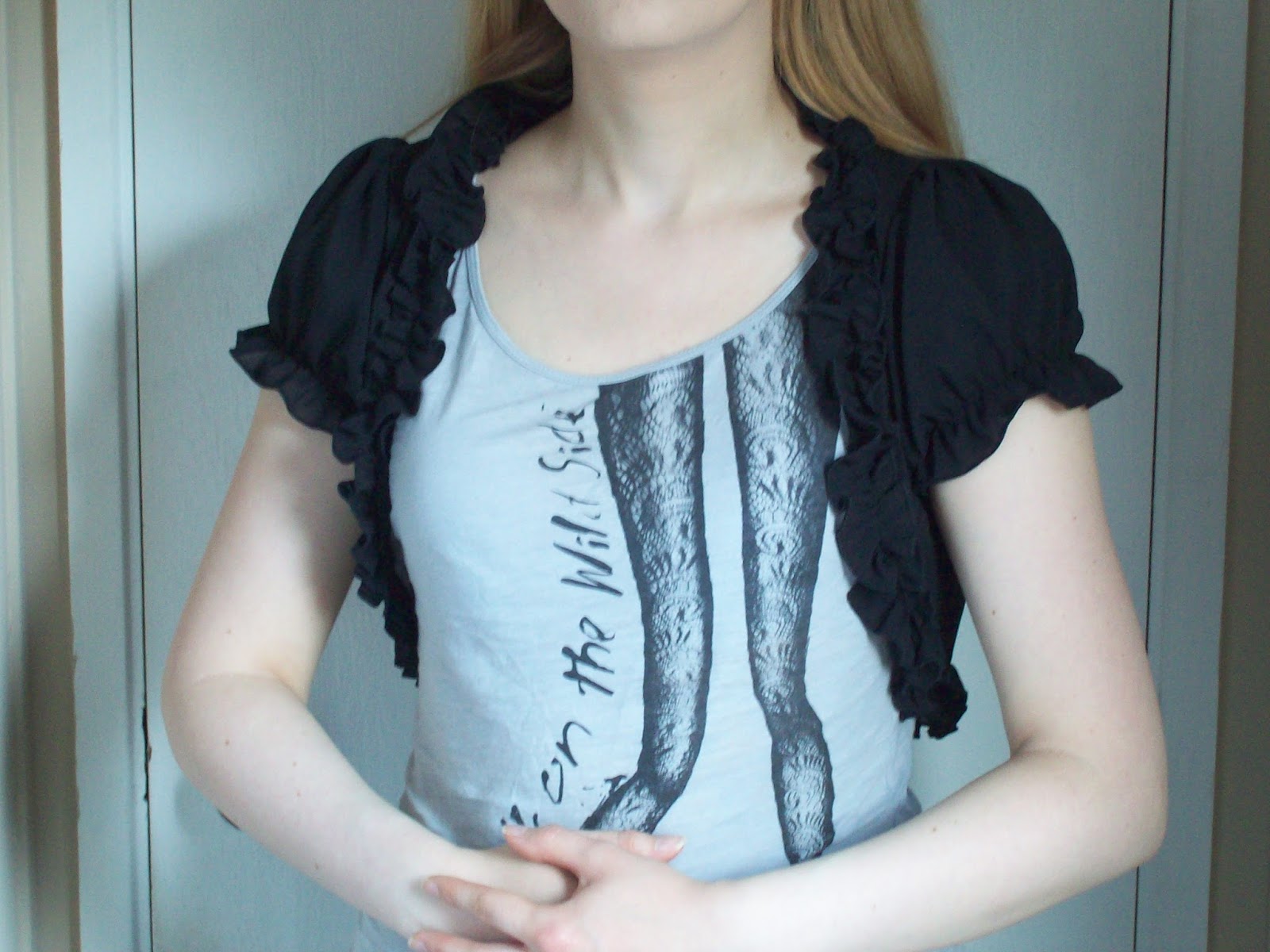
Apologies for the 'normie' clothes, it had been a long day. Google Translate was able to translate the sizing chart okay. The sizing seems to be pretty accurate and I found my boleros fit me very well. In fact, I can say with confidence that my boleros look just like they do in the worn photos on the item listing.


A little bonus photo of the back. You can probably see that the material does wrinkle slightly, but nothing too bad. A bit of steam should get those wrinkles right out. These boleros have actually proven to be quite a nice surprise. I still wouldn't recommend Miss Moe if you are after good quality, but I do think you get a fair deal considering the cheap prices. There is not really much to complain about here.

Considering I only placed this order for the boleros, I seem to have had some pleasant surprises with this order. The ring from Cutie Creator is the only thing I am very disappointed with. The gloves from Haruhi Clover could have been better as well, but at least they are wearable. I think my favourite part of this order has to be the Emomo headdress. I ordered it on a whim, and it turned out really great. I am happy that this has generally been a positive order.


Monday 27 June 2016

Harlequinade by Angelic Pretty

Today I shall be having a look at Harlequinade by Angelic Pretty. This series includes 3 dresses, a skirt, 2 hair accessories and socks.


First up is the OP. The shape of the bodice is cute, although I think it could have been a bit better fitted. I love the contrast between the main dress fabric and the tulle, with the tulle part looking like a really convincing blouse. The sleeves could have been puffier, but the length is nice. The lace on the sleeves and the collar is of a good quality with a lovely design. It sits well on the tulle and has been layered well. The seam between the main dress and the tulle is a sweet heart shape, which looks really pretty. There is then a line of gold trump shaped buttons leading up to the collar, which has a great design, and the buttons are well spaced out. There is then a small metallic bow on the chest area and a larger bow on the collar. I am not overwhelmed by the metallic bow, as I think it could have been shaped in a more interesting way. It sort of looks like a bow you would see on a cheap chocolate box. As for the bow on the collar, it is a bit large in size, but it has a lovely shape to it. I really like how the edges of this bow have been lined with thin gold lace. Sadly though, I feel the collar bow makes the dress look a bit too bow-heavy. This bow is detachable, and I think I would detach it if it was me. The bodice has 2 ribbon corsets going down either side. I feel the ribbon corsets could have been better positioned (maybe a little further apart and more to the sides?) but they are otherwise well done. The ribbon is well spaced out and it only has a slight sheen to it. The edges of the ribbon corsets are also lined with lace, which keeps things looking very tidy. At the waist there are 2 solid coloured bows and an over-skirt. The over-skirt is a fantastic shape, which ends well before the border print and sits nicely on the dress as well. I am a little unsure about the bows though. They are a cute shape, but a little bit big in size. They also look as though they sit quite awkwardly on the dress as well. The back of the dress offers no shirring, so size flexibility is limited. The zip itself is fairly well concealed, although the print could have lined up a bit better along the zip line. The stock photos show that the skirt is very full and it flares outwards generously. There is the potential to create a really plump, full sweet shape. Aside from the over-skirt and the bows, the skirt is relatively simple, so the print is displayed reasonably well. The way the skirt material is gathered means the print is not displayed as well as it could have been though. The bottom hem is then finished off neatly with a line of crown and trump themed lace. I really love this lace design and it is the perfect choice for the print.


Here we have the Switching JSK. The bodice seems well fitted, but the bodice shape is a bit simple. However, I feel the details on the bodice really make up for the bodice shape and make it quite eye-catching. The straps seem a fair width and quite supportive. I really love the way the lace tops the straps and then continues down in a V shape to the waist and the waist bow. The lace has been layered well and it creates a very frilly and interesting texture. The lace used is really pretty in design as well. I think the waist bow is near perfect as well. The bow has an adorable shape to it, it is a suitable size and it sits really well on the dress. The only thing I might possibly change about it is to make the tails going down the skirt a little bit shorter. The insides of the lace are lined with gold braid, and then the material is solid coloured. I like that the solid coloured material here helps to break up the print. Gold braid is then carefully looped inside the triangle, which creates interesting swirls and movement. The gold braid then goes along the neckline, and there is a subtle line of thin lace lining the neckline as well. This makes the neckline look a lot less plain. There is a small bow on the neckline, which is a good shape and size. It could have maybe been a bit smaller. The back is fully shirred, which means lots of size flexibility, but the unattractive looking shirring is left very exposed. The stock photos show that the skirt has more than enough volume and it flares outwards loads. There is more than enough room for petticoat. The skirt is kept simple in design, so the print is displayed beautifully. The bottom hem is then finished off with a line of the same crown and trump themed lace, layered neatly over a ruffle of tulle. This use of detail is a good match for the lacy details on the bodice.


This is the Standard JSK. The bodice seems well fitted and overall I think the bodice shape is quite pretty. The straps are perhaps a bit on the thin side, but wider straps probably wouldn't have suited the bodice that well. However, I think the lace lining the outsides of the straps has a gorgeous design to it and is quite nicely shaped. My main concern with this dress is the organza belt. I have the Daydream Carnival JSK with a similar belt to this one, and from experience I find the belt rarely sits right and wrinkles up badly. I don't expect it to look as perfect worn as it does in the stock photos. The bodice features several lines of lace, some of which are lines of thin gold lace. The lace has been set out quite neatly and the wider lace in the middle sits quite well on the dress. There is also a line of gold trump shaped buttons running up the middle. Whilst the buttons are cute, the button at the bottom is quite badly positioned just above the belt. In the close up photos, it also looks as though little effort has been made to make sure the buttons sit correctly. There is a metallic bow on the neckline, which I feel looks really cheap. It also looks a bit stiff, as it seems to be sticking out at an odd angle and looks a bit strange. A softer choice of ribbon would have perhaps looked a bit more natural. The neckline is then lined with gold braid, which keeps it looking smart. Personally, I would have liked a thin line of lace along the neckline, just to soften it a bit. The back has a panel of shirring, which has been topped neatly with a ribbon corset. The stock photos show that the skirt is very full and it flares outwards loads. I like the full, rounded shape in the stock photos and think the skirt has a lot of potential. The skirt is kept simple in design, so the print is displayed perfectly. The bottom hem is then finished off neatly with the same crown and trump themed lace.


Finally, this is what the print looks like. This series comes in pink, sax blue, navy blue and black. All 4 colours seem to work okay with the print. None of the colours seem out of place, although I do wish a more vibrant gold had been chosen for the print on the black version. As for the print itself, the individual components are pretty and well drawn, but as a whole it is too much. When you look at the print on the dresses, it all feels a bit overwhelming. I really like the border part of the print, but I think it needs to be simplified a bit. It is really difficult to make out the trump shapes with all the random swirls of gold going on. The horses are beautiful and I am a fan of the rabbits too. I feel the non-border part of the print needs to be simplified as well. I find it a bit too distracting.

So whilst in some cases the dress designs seem okay, I have to say I don't like these dress designs with this particular print. It feels too OTT. I am having a hard time working out if it is the dresses or the print which is the problem. I usually would like this sort of print, but looking at this print, I am really not a fan. So I think it is safe to say that I would not go for this series. My top choice would be the Switching JSK in navy. If it wasn't for the print, I would probably really like the Switching JSK, as I think it has an interesting design. I have a feeling I might be in the minority liking this design the most though!


Thursday 23 June 2016

Scentsational

I told myself I wouldn't be one of those people who use dodgy puns and plays on words, and yet here we are...

When I was little, there was a time when I seriously wanted to be a perfumer, creating my own fragrances that captured the spirit of life's special moments. I was the sort of girl who never really bothered playing with her mum's make up, I just wanted to wear her perfume (and I would get in trouble for spraying her expensive perfumes everywhere!). Even now, make up never really excites me as much as perfume does. When my mum took me shopping, she would leave me by the perfume aisle, so she could shop in peace whilst I tried out all of the testers. The shop staff began to recognise me and would even give me free  perfume samples when they got any in! I would mix bath products and pretend I was some sort of perfume witch, making magic potions that would make people fall in love. That probably sounds really silly, but I guess I was a bit of a weird kid.

Fragrance is a bit of a weird topic when it comes to lolita. It is not really that widely discussed. When you look at an outfit picture, do you usually think about what perfume they are wearing? Most of the time we are focusing on the clothing. You can't reach in to a picture and smell perfume. For all we know, the outfit wearer could smell completely different to how we would expect. And yet, I still feel that perfume could play a big part in lolita in the wider sense, even for the non-lifestylers. It can be easy to forget how big a role scent plays in our life. Shops pump out smells to encourage us to buy more, it lingers on our bodies and on our belongings and scent can trigger memories. Similarly, wearing a favourite scent can remind us of memories of when we previously wore it. As time has gone on, I have noticed that I have started saving certain scents for when I wear lolita. I guess I do it because for me, dressing up in lolita is special, and the whole getting ready phase is part of the experience. That includes a spritz of perfume right before I walk out of my front door. It also helps me to connect that scent with lolita meets and all the fun things I have done. I associate that scent with happy times where I have met up with friends and have worn the clothes I love.

I will admit though, that I have never purposely chosen a scent to match my outfit. I tend to go for the perfume I happen to fancy wearing that day, rather than matching sweet scents with sweet lolita and classic scents with classic. So I decided it would be fun to see if I could make perfume collages for each of the 3 main lolita styles, with scents that match the look. I found there were certain challenges that came with each style, but I did enjoy looking up fragrances. In fact, I had to stop myself from buying anything! As a little disclaimer- it is worth mentioning that not all of these perfumes may be available in your particular country. I also decided to include a few other scented products, rather than sticking to just perfume.


Classic

1. Chloe Eau De Parfum 2. Lush Imogen Rose Fragrance 3. Viktor and Rolf Flowerbomb Eau de Parfum 4. Marc Jacobs Gardenia Splash Perfume 5. Miss Dior Eau de Parfum 6. Lancome La Rose body lotion 7. Cath Kidston Meadow Posy body wash


For the classic collage I felt it was important to include some nice floral options, but at the same time for the florals to not be too "old". The aim was for something a younger person would wear, rather than your grandma. I chose what I feel are some fresher smelling options. There are also some musky scents as well. I've always loved the smell of roses (as in the actual flower) and Lush's Imogen Rose is one of the few rose perfumes I have found which doesn't have that typical artificial rose smell you typically find. Marc Jacobs typically has a good reputation, and after searching a couple of different top notes online, I discovered their Gardenia Splash perfume with its fresh, green notes.


Gothic

1. Black Phoenix Alchemy Labs Snake Oil 2. John Galliano perfume 3. Tom Ford Black Orchid perfume 4. Absinthe and Sugar body lotion by Bloodbath on Etsy 5. Ghost Deepest Night perfume 6. Lush Devil's Nightcap soap 7. Dior Midnight Poison eau de parfum 8. Opiate by Enchanticals Perfume on Etsy


I was initially unsure which way to go with the gothic collage, but typically if a perfume sells well, a "night" or "dark" version will probably follow! This is why I ended up with the Dior and Ghost perfume. The Ghost one is actually one of the first perfumes I was actually given, rather than "borrowing" my mum's stuff, so I have fond memories of it. You can't really do a gothic perfume collage without a mention of Black Phoenix Alchemy Lab! I know several friends who love collecting B-PAL fragrances and they are always raving about them.


Sweet

1. Body Shop Vanilla perfume 2. Lush Candy Fluff dusting powder 3. DKNY Be Delicious Candy Apple in Sweet Strawberry perfume 4. Imperial Leather marshmallow shower gel 5. Vera Wang Pink Princess Eau de Toilette 6. Nina Ricci Les Delices de Nina eau de toilette 7. Yves Saint Laurent Black Opium Nuit Blanche eau de parfum


For the sweet collage, the main challenge was to not go too childish, but at the same time to get some really good sweet notes. If you happen to like those sickly sweet scents that are typically aimed at the Claire's Accessories crowd, then fair enough! I personally prefer my sweet notes to be a little bit more subtle. The options I included feature a lot of vanilla and strawberry notes. I can personally vouch that the marshmallow shower gel is sweet without being overpowering. The Yves Saint Laurent perfume may seem like an unusual inclusion, but I happened to get a sample of it in an online order I placed and it is surprisingly sweet but in a mature way. I was initially worried about the coffee notes, but the main note I get from it is vanilla. In fact I love it so much, I am going to invest in a full-size bottle soon.

I feel like I have only really scratched the surface here, but there are many websites (like fragrantica.com) where you can search for a perfume by picking out top notes. I always feel with fragrances though, it is always best to go in to a store and try before you buy. And it is important to only try out a few perfumes at a time! I love the feeling of discovering a new favourite scent, especially when it is an unexpected find. Are there any other perfume addicts out there? I am curious to know if any lolitas out there match their fragrances to their outfits or have particular scents they save for meets.


Monday 20 June 2016

Another Print Double

Today I am looking at 2 prints. Scroll down further for AP's Aquarium Carnival.

First up today I am looking at Ribbon C'est Bon Belle Journee by Baby the Stars Shine Bright. This series includes 3 dresses (one is non-print), a skirt, 2 hair accessories, a blouse, a tote bag, socks and an outfit for Usakumya.


First up is JSK I. The bodice seems well fitted and the bodice shape looks interesting. I think the straps look a suitable width and are supportive enough. The straps are also lined very neatly with some thin lace, which stops them from looking too plain. There is a ribbon corset on the front of the bodice, where the ribbon has been spaced out fairly well. The ribbon is a little bit shiny, but nothing too intense. What is interesting about the ribbon corset is that Baby have concealed the sides with a line of scallops. Usually, this would set off my in-built scallop alarm (I don't usually like scalloping) but the scallops have been well shaped and the neckline bow conceals them a bit anyway. There are also some lines of cute heart shaped lace going along the sides of the scalloped parts, which also helps to keep everything neat. The neckline features a line of lace, which is of a reasonable quality and has been nicely shaped, so it tapers off gently at either side. The lace is mostly concealed by the 3 bows on the neckline though, so I guess the lace is mostly there to fill in the empty gaps underneath. The middle bow is a little bit on the big side, but nothing too intense. I do feel the lace lining this bow emphasises its size though. The shape of this bow is cute, although the bow does seem just slightly droopy in some of the stock photos. The other 2 bows on the neckline are bows that have been placed at the bases of the straps. Not only are the bows super shiny, I can't say I am really feeling the use of different patterns on the bows. One is polka dot and one is solid coloured ribbon. As there are no other areas on the dress that has this mis-matched bow idea, it sort of feels a bit mis-placed having the different bows here. I wouldn't have bothered with the polka dot bow and just made it the same as the other side. The back has a panel of shirring, which has been topped neatly with a ribbon corset. The stock photos show that the skirt is quite full and it flares outwards plenty. There is more than enough room for petticoat and I think this skirt has the potential to look really cute. The skirt is also kept quite basic in design, so the print is displayed beautifully. The bottom hem is then finished off with a thin line of cute heart shaped lace and then a line of not-so-cute, but still good quality wider lace.


This is JSK II. The bodice seems well fitted and although the bodice shape is quite simple, it is still fairly cute. I think the straps are a fairly reasonable width and they suit the style of the bodice. They are neatly lined with lace on the outsides too, with this lace complimenting the lace going along the neckline really well. The waist area features 2 lines of lace, giving the waistline the appearance of having a belt. This nips in the waist area nicely and I think the lace sits on the dress perfectly. It all looks quite neat and tidy. There is a waist bow, which is really big in size. In this instance however, I think I can forgive the bow being a bit on the big side, as to be fair bows are a big part of the print. Also, the tails of the bow have been folded to create an interesting shape. It gives the bow more depth and movement. I also really love the use of lace on the bow, as it has been executed so brilliantly. The bodice features a slightly raised panel on the chest area. It wouldn't bother me too much, but the shape of the hemline on this raised part looks terrible. It is very slightly scalloped, but it doesn't really have that defined a shape. I wouldn't have bothered with this raised panel at all and would have just stuck with the lace, which I feel has been used quite nicely on the bodice. The chest panel is topped with a bow which I feel is a bit too big, considering there is already the large waist bow. This chest bow is also a bit too shiny, although the shape of the bow is pretty. The back is fully shirred, so there is lots of size flexibility, but it means the shirring is exposed with nothing to help cover it. The stock photos show that the skirt is very full and flares outwards lots. I really like the shape of the skirt in the stock photos and think it has a lot of potential. The skirt is again kept very simple in design, so the print is displayed excellently. The bottom hem is then finished off with the good quality, but slightly boring lace. I was a bit surprised Baby didn't use the heart lace as well here, like they did with the other dress.


Finally, here is one part of the print...


... and another part. This series comes in ivory, pink, red and black. The colour choices remind me of the sort of colours that used to be popular choices for Baby in the late 2000's, which is sort of the feeling I am getting from the print as well. I for one am glad that this sort of series is making a bit of a comeback, although I think a mint colour way could have looked really cute. As for the print itself, it is adorable. I love the way that Usakumya and friends are peeping out from underneath the masses of ribbons and bows. The bows and ribbons are drawn nicely, with a lot of movement going on. I feel all the cute critters are perfectly positioned. The gaps in the print are also filled up with dangling hearts and bows, so there are no areas that look too empty.

So overall this is a really sweet series and exactly the sort of thing that I have come to expect from a Usakumya themed print. It does feel a little bit like this series could have been released in 2010 rather than 2016, but that is not necessarily a bad thing. There are a few small things I would change about both dresses, but they are still pretty decent designs. Would I buy this series? No, because it is far too cutesy for me! But I think it is a good series, if you are in to that sort of thing. My top choice would be JSK I in pink. 


I am also taking a look at Aquarium Carnival by Angelic Pretty today. This series includes 3 dresses and a head bow. Several marine themed items have also been released, including a bag and a blouse. The Jewel Marine socks have also been re-stocked.


First up is the OP. The bodice shape is a bit lumpy and bumpy, and I think the cause of this is where the bodice splits across the chest. I feel that AP should have made this join between the ruffled chest area and the bottom half with the lace corset lower down. That way, the wearer wouldn't have to worry about the details potentially cutting across their chest awkwardly and sitting funny, and it would also make the bodice look a bit more balanced. I also don't think the line of chiffon going across the chest really helps with the appearance and it sits strangely. The see-through chiffon sleeves are very cute though, and I love that part of the design. The material is gathered well to create quite a nice shape, and the lace and bows on the sleeves are so pretty. The lace especially is a great choice, as it has a gorgeous design to it. There are also some pearls dotted about the sleeves, which are a lovely finishing touch. I am not a fan of the very square neckline shape though, and I feel it needs to be a softer shape. There is a line of lace topping the waistline, which again has a fantastic design to it and I appreciate that AP have gone to the effort of shaping the lace so it tapers off in the centre. I think as a result, the lace sits quite well on the dress and doesn't make the waistline look too bulky. The bodice features several lines of thin lace, which have a suitably ruffled appearance and looks very frothy. However, I can't say I am fond of the criss-crossed lace, styled to look a bit like a ribbon corset. I just don't feel the lace really works in place of ribbon and also, the bodice has enough detail already that I don't feel this lace is needed. The chest details and the thin lines of ruffly lace could have been enough by themselves. The chest area is topped with 2 bows, which in my opinion look a little bit cheap and tacky. The materials are not of the best quality and I don't see the need for 2 bows here either. One bow, made of better materials, would have sufficed. The back has a panel of shirring, which is concealed neatly with a ribbon corset. The stock photos show that the skirt is quite full and flares out reasonably well. It should hold enough petticoat to create a decent shape. The skirt has been kept simple in design, so the print is displayed beautifully. The bottom hem is then finished off with this gorgeous shell shaped lace layered over 2 chiffon ruffles. I really love the soft, floaty bottom to this dress. 


Here we have the Peplum JSK. The bodice is an okay shape, but I am slightly concerned it doesn't look that bust friendly. I also feel the bodice shape is a bit simple, and is maybe lacking something. The straps are quite thin and look a little bit flimsy, but wider straps maybe wouldn't have suited the style of bodice. However, I am a fan of the way the outsides of the straps are lined with beautiful lace layered over a chiffon ruffle. The materials have been shaped excellently and are layered so well. There is a waist bow and a double layered over-skirt at the waist area. Although I think the waist bow has a pretty design with the pearls and lace, I am not sure it really compliments the over-skirt that well. Maybe it is the size and shape of the waist bow? It feels a bit too solid and bulky teamed with the over-skirt. Both the waist bow and the over-skirt are detachable, and I assume the bow and over-skirt are detachable from each other. It does seem a shame to detach the bow, but that is what I would do with this dress. I feel the over-skirt needs more material, as in some of the stock photos the over-skirt looks like it hasn't got enough material to sit nicely on the dress. It is a slightly strange shape as well, although I am glad that the over-skirt ends way before the border print starts. I think the over-skirt could have looked really amazing with this series, but AP have not quite pulled it off. So sadly, I would probably detach it and make an over-skirt of my own for it. The bodice features some subtle lines of lace, which helps to break up the empty space without being over-whelming. The neckline then features some wide lace which is layered over a chiffon ruffle. I like that this matches the strap details, but the lace and chiffon on the neckline needs to be a bit better shaped. It needs to gently taper out before it hits the armpit area, which would have looked a bit tidier. There is also a double pearl chain dangling from the neckline. I personally feel the length of the chains could have been better, but it looks okay. I do like the teardrop shaped pearls dangling from the bottom of the 2 chains. This detail is detachable as well, but I think I would leave this chain attached. The back has a panel of shirring, which has been well concealed with a ribbon corset. However, the wide trims from the neckline on the front continue all the way on to the back and the sides of the shirring panel, which looks a bit messy. The stock photos show that the skirt is very full and flares outwards generously. I really love the plump bell shape in the stock photos. Aside from the over-skirt, the skirt is again kept simple, and so the print is displayed perfectly. The bottom hem is then finished off with the shell lace, layered on top of a single chiffon ruffle. It would appear that some of the shell lace is a bit obscured here, compared to the use of this same lace on the other dresses. It still looks pretty, but I would like to see more of it!


This is the Standard JSK. Like the other JSK, the bodice seems very simple in shape and again not that bust friendly. The shape of the bodice is also very square and a bit boring. I also think the straps are far too thin and they don't like even the slightest bit supportive. They are lined neatly with pretty and good quality lace on the outsides though, and the pearls dotted along the straps is a nice touch. The waistline of the dress is over-stitched, so there is a bit of a ruffle going along the waistline. It doesn't look too bad, but I don't think I am a fan. There are also 2 large ribbon bows on the waistline with large tails going down the skirt. The bows themselves are a cute shape and the ribbon used only has a slight sheen. However, I feel the 2 bows need to be spaced further apart and more to the sides. It is  a shame these bows are not detachable, as I would have liked the option to position them how I like. The bodice is mostly kept simple, with just some subtle lines of thin lace running up it. I suppose with the neckline details and waist bows, a lot of detail is not needed, but I think something a bit more interesting could have been done. At least the lace used is of a nice quality. The neckline has a very wide line of lace, which is topped with 3 polka dot bows and a pearl chain running between the bows. The bows are a cute shape and size, and I really love the idea of having the pearl chains dangling between them. I do feel though, that the use of polka dots is a bit out of place. The bows also have a jewel in the middle, which works quite nicely, although I feel it would have worked better with solid coloured bows. There is a narrow ruffle of tulle going along the neckline, which has been well gathered and helps to soften the very straight neckline. The back is fully shirred, which means plenty of size flexibility, but it also means the unattractive looking shirring is also exposed. I noticed the shirring isn't that noticeable on the darker navy colour way though. The stock photos show that the skirt is generous in volume and it flares outwards plenty. I like that the skirt seems to have a decent amount of length to it and I think there is more than enough volume to the skirt to create a great shape. The skirt is kept simple in design once again, so the print is displayed brilliantly, although the tails from the waist bows are a little bit distracting. The bottom hem is then finished off with a line of good quality lace layered neatly on top of a tulle ruffle. I am a bit surprised that AP didn't use the more decorative shell shaped lace here.


Finally, this is what the print looks like. This series comes in pink, sax blue, lavender and navy blue. These colours are pretty typical of a marine themed print and they all work very well. I think a green colour could have been interesting, maybe not mint, but a sea foam sort of shade. As for the print itself, I think it is well laid out with the border part of the print neatly set out. The dolphins look pretty cute, although I know not everybody is in agreement about that. I like the way their bodies are angled to make it look like they are swimming. The fact that the dolphins are wearing crowns is a nice touch as well. The shells and patches of coral fill in the spaces at the bottom nicely. I really like the pearl chains with the stars and moons dangling from them as well. The non-border part is suitably gorgeous as well. I like that the background has been kept relatively simple, to stop the print from looking too busy. I know some people will argue that some of the fish here are freshwater fish, but I think I could look past that! The bubbles are drawn well and I think it is really clever how some of the bubbles have a subtle AP logo in them. 

So I feel this is actually quite a cute print, and it is really surprising to see that this hasn't sold well, at least not in Japan. I have to admit though, that I am not sold on the dress cuts. There are things I would definitely tweak with each dress. Would I buy this dress? Possibly, but not at retail price. It doesn't really fit in with my current wardrobe, so I would have to get an absolute steal on it for me to even consider it. And as far as marine prints go, I am still on Team Dream Marine. My top choice from this series would be the Peplum JSK, even though I didn't like the over-skirt. At least it is detachable. As for the colour, I am surprisingly torn. You all know I am usually a big fan of navy blue, but I find myself drawn to the sax blue and the pink as well. It is hard to say why this series hasn't done that well. Maybe it is because people don't like the dolphins or perhaps people are just a little tired of marine themed prints.


Thursday 16 June 2016

Conflicting Feelings on Punk and Punk Lolita

As I write this post on a rainy afternoon in April (EDIT- yes, this post was meant to be published April 2016!), I have my earphones firmly stuck in and I am taking a serious nostalgia trip. One of my favourite albums of all time is playing and despite only being at the start of this post, I have already had to stop a couple of times to simply close my eyes and immerse myself in the sound of buzz-saw guitars and a voice that gets under my skin the very second I hear it. As it happens, the Ramones' self-titled debut album turns 40 this month, and my favourite band and the genre of music they helped to create is firmly in the forefront on my mind. Long before I had ever heard about lolita fashion or even met my future husband James, I was in love with punk rock music and in particular the Ramones. The Ramones spoke to me in a way that nobody else could and this little reject had finally felt like she had found a place in the world she could call her own. I can still remember the first time I was hit by the full force of Blitzkrieg Bop as it blasted out of my computer speakers, how I melted as Joey sang I Wanna Be Your Boyfriend and smiling at the bizarre lyrics of Havana Affair. Punk rock will always be a part of my life.


So when I first got in to lolita fashion, you would think that punk lolita would pique my interest. I mean, I listen to punk rock, so surely punk lolita is a dream come true for me? It was a way I could combine 2 of my favourite things. Well, the truth is that the idea of punk lolita has never been an idea I have been comfortable with. On the day the Ramones' debut album turns 40 I will be in London with Sammi and Shalisa, wearing lolita and not really doing anything remotely 'punk rock'. I guess because this trip to London falls on this anniversary, the idea of punk and punk lolita have been playing on my mind a lot lately.

To put it simply, I just don't feel that the whole ethos behind lolita and punk really combine that well. If you look at the punk lifestyle of the late 1970's and then compare it to the 'rules' of lolita fashion, there is a conflict of ideas. Although the 'rules' of lolita are more like a set of guidelines, I think it is safe to say that the vast majority of lolitas do follow these same rules. When you look at a lolita outfit, most of the skin is covered. Despite the clothing being very flamboyant at times, a big ideal of lolita fashion is to appear modest. I appreciate that the idea of the lifestyle lolita is not as popular nowadays as it was when I first got in to the fashion in 2009, but I still feel there is this sort of lolita 'attitude' I guess you could call it. We all have an idea of what a lolita should look like and how we behave when we are dresses up. A typical lolita meet would be a trip to a fancy tea place or a picnic. Whilst there are some more 'out there' meets which get a bit more inventive, the majority of meets probably still fit in to the old lifestyle ideals in some way or another.

Let's now have a think about how the punk scene, and in particular the fashion, grew from its early roots. Right from the start the Ramones had their 'uniform' of a leather jacket, keds and tattered jeans which were full of holes. They were constantly booed, had bottles chucked at them and had a bad reputation. Johnny Rotten was apparently nervous to meet the Ramones when they came to the UK. As the scene spread to the UK, the fashion developed more and the Sex Pistols sort of became the poster boys of the punk scene. Ripped clothes, swastikas, leather jackets and loads of safety pins. What I loved about the punk fashion was that even though the likes of Vivienne Westwood were popular in the scene, it was still possible to join in. There was a lot of DIY going on and even hand-me-downs were prevalent. The fashion was as controversial as the music. It shocked people and was considered offensive by many.

Although lolita fashion stands out just like the early punks did, I think the fashions stand out in very different ways. Lolita is colourful, puffy and full of frills, but could you ever really call it offensive? Even when you look at punk lolita, I don't think many people would call it obscene.

Although lolita fashion has been around since the 80's, the look that we associate with modern day lolita really only started to properly develop in the early 2000's. Incidentally, it was around this time that pop-punk was having a bit of a moment in the charts. Musicians like Avril Lavigne (I hate Avril so much, but that is a long story...) burst in to the music industry with guitar-led pop songs and a distinct look that involved a lot of tartan and ties. This look was being touted as punk rock, only this time around it was a lot less offensive and was marketed in a more cutesy way. Lots of teenagers raided Hot Topic to get the Avril look. The tartan was back, but this time there were ruffly skirts. You could now buy tops with holes pre-ripped in them, but a lot of the time there was fabric underneath to stop skin from showing. Skulls were a popular theme, but this time the eye sockets were heart shaped and the skulls wore bows. To be frank, it was not the same punk from the 1970's.

And I feel it is from this new wave of watered down punk fashion, that punk lolita was truly born from. It is worth noting that Avril Lavigne was very popular in Japan. Punk lolita typically features a lot of tartan, maybe with the odd band t-shirt thrown in, and even then some complain about the use of plain t-shirts instead of cutsews. You may get the odd safety pin, but a lot of the accessories are not that different from other sub-styles of lolita. And I think this is what puts me off attempting punk lolita. It is not the style of punk that I fell in love with. It lacks the 'rough edges' and the rawness I feel when I listen to my favourite bands. The trouble is, I feel that if one were to do a punk lolita outfit based on the ideals of the 1970's fashion, it would be shouted down as being ita.

Maybe my issue is not with the idea of punk lolita itself, but with the name. Punk is a very specific genre of music, with a very well-known look, and punk lolita is not what I picture when I think of that music. Perhaps a slightly more generic name like "Rock Lolita" would be more suitable? Despite this being a topic I feel quite passionate about, I really struggled with writing this post. I don't wish to come across as some sort of prude who feel lolitas have to act in a certain way! But I think it is safe to say that lolita does have specific guidelines and these guidelines are sometimes at odds with the old school punk ideals. I love punk and I love lolita fashion but I am happy to keep them separate from each other, and that is just how I choose to go about my personal life choices. If you choose to wear punk lolita, I am not going to judge you for it!

Monday 13 June 2016

A Print Double

Today I am taking a look at 2 different series. So scroll down further to see my thoughts on Angelic Pretty's Antoinette Decoration.

But first up today I am looking at The Ticking Clock by Alice and the Pirates. This series includes 3 dresses, a skirt, a hair accessory, a blouse, socks and several pieces of jewellery.


First up is JSK I. The bodice seems well fitted, although the shape seems a little weird. I think it might be the way the fabric on the straps drapes down. Something about it just doesn't look quite right and I think maybe it would have looked better if the material gently tapered off rather than being left to hang down the bodice. If it wasn't for the untidy looking dangling bits, the straps (well, they are more like sleeves, and I would treat this dress as an OP almost) would be quite pretty. I like the layering of the main dress fabric over the shimmery tulle. The tulle bit is shaped so nicely and it looks lovely. There is a waist bow, which is a decent shape and size. It holds its shape well and sits quite well on the dress with no signs of drooping. This waist bow is detachable and although the bow is pretty, I think the dress looks better with it detached. There isn't a great deal of detail to the main part of the bodice, but I feel there is enough detail on the neckline to make sure the dress doesn't look too plain. The neckline features a pretty semi-circle of lace, which looks to be of a good quality and has a nice design. There is then a small chain and a cute star charm dangling on top, and I think the charm looks really great. The star charm and chain is detachable, but I would leave it on. The back has a panel of shirring which is topped very neatly with a ribbon corset. The stock photos show that the skirt has a good amount of volume and it flares outwards well. The sweet bell shape looks really lovely and the skirt should hold more than enough petticoat. I like that the skirt is kept simple in design, so the print is displayed perfectly. The bottom hem is then finished off with some star shaped lace and a neat ruffle of tulle. I think that if the star charm is left attached, the lace at the bottom ties in with the rest of the dress perfectly. The tulle ruffle matches the sleeves too.


Here we have JSK II. The short bodice looks well fitted, but I think the bodice shape is a bit too simple. The straps are a bit on the thin side, but I don't think wide straps would have suited this particular style of dress. However, I do think AatP could have gone a bit more extravagant with the choice of lace lining the outsides of the straps. I feel the straps look quite plain, although I am glad there is a bit of lace there, rather than nothing at all. There isn't a massive amount of detail to the bodice, but the bodice is very short anyway (that high waist will certainly be unpopular with some people). The neckline then features 2 lines of lace and some shimmery tulle layered on top of each other. I like that the lace and tulle is of a reasonable quality with a nice design, and the layering has been doen well too. However, I do think the lace needs to be a bit more shaped at the sides. There are also 2 small bows at the bases of the straps, which on certain colour ways (like the purple colour above) adds a nice little pop of colour. This little bit of colour does appear in the print, so it is not as if the bow colour is out of place. The back is fully shirred which means lots of stretch, but it does mean the shirring is exposed and not too attractive to look at. I guess though, that with such a short bodice, a ribbon corset wouldn't have been worth including. The stock photos show that the skirt has lots of volume and it flares out well. There should be enough room to create a great shape. The skirt is kept simple in design, so the print is displayed excellently. The bottom hem is then finished off with a line of thin good quality lace and a tulle ruffle. As there are no star details on the rest of the dress, I think AatP made the right choice by not using the star lace again here. 


This is the OP. The bodice looks well fitted, but I really hate the bodice shape. There is something about the shoulders and the shape of the sleeves which makes the bodice look a bit odd in my opinion. I think the sleeves need to be shorter and a bit puffier. The shape of the collar is terrible and it looks like a bog-standard work shirt collar. It looks so basic and I would expect something a bit more special looking. The bodice is incredibly plain, with the only real detail being the change of material on the shoulders. There isn't even any lace lining the seams or going down the bodice. It is boring! The back offers no shirring, so size flexibility is very limited. I feel the back could have been done neater, with the print lining along the zip line better and also not having the gaping hole at the top. Even the button that does up the collar at the back is very basic and dull. The stock photos show that the skirt has a fair amount of volume and flares outwards okay. The skirt is once again kept simple, so the print is displayed really well. The bottom hem is then finished off with a ruffle of tulle, which looks pretty, but I wonder why they didn't bother using any lace here either. I am really baffled by how plain AatP have made this dress.


And here is a small look at what the print looks like (I couldn't find a decent print picture unfortunately). This series comes in sax blue, blue, purple and black. They all sound like decent colour choices for this sort of print, but sadly the black colourway features the most hideous shade of yellow and also this sludge looking brown. Thankfully, the other 3 colours all look quite complimentary and work with the print. As for the print itself the sky looks very dreamy, with soft colours. The buildings at the bottom are a bit basic looking and look a bit like shapeless blobs in places. The silhouettes of the Peter Pan characters have been well done though, and I like the way that script has been used to fill in the shadowy characters. The other items floating about in the sky are done softly, which is good because it means they are not too attention grabbing. I think a lot of the focus is on the use of colour and the silhouettes, which is nice.

So overall, I think this series is okay, but nothing over-whelming. I am not really a fan of any of the dress designs, although some are definitely better than others. As for the print, I really like the use of colour and shadows, but I am not too fussed about the bottom of the print. To be honest, I have never really been a fan of Peter Pan, so this series was always going to be hard to please me. So I think it is safe to say that I wouldn't buy this series. My top choice would be JSK I in blue. Some of the jewellery from this series is really pretty though.

Next up today is Antoinette Decoration by Angelic Pretty. This series includes 3 dresses, 2 hair accessories and tights. 


First up is the OP. The bodice seems well fitted and the bodice shape is lovely. I initially felt that the sleeves could have been puffier, but on reflection I feel the sleeves have a nice mature look to them, which suits the slightly maturer print. The lace on the sleeves has a pretty design too, although I wish AP hadn't put bows on the sleeves as I feel the bows are a bit too much. I find the bodice of this dress so overwhelming. There is lace and bows everywhere. It feels like there is never-ending layers of lace on top of lace and the bows are quite big in size as well. Personally, I think I could forgive the bodice if the waist bow was detachable and there was just a little bit less of the lace. The waist bow is a cute shape and it has even been decorated neatly with lots of pearls, but I think it pushes the OTT feel of the dress a bit too far and I am a fan of a nicely defined waistline as well, which the bow distracts from. The lace on the bodice has a gorgeous design to it and it is layered nicely, but I think the ruffles and lace going up the sides are not needed. The bows on the bodice are very nicely shaped and sit well on the dress. They are nicely spaced out as well. I just feel all the bows just needed to be a bit smaller in size. The very top bow has a detachable brooch, which has a pretty design. I think I would detach it, just to tone down the dress just that little bit more to be honest! There is also a matching choker, which is very lacy, but at least it matches the dress perfectly. The back has a panel of shirring, which is topped neatly with a ribbon corset. To add to all of the business of the bodice, there is also an over-skirt. The over-skirt is made of such lovely material and the hem is finished off so neatly as well. I also like that the over-skirt finishes before we get down to the heavy detail of the boder print, so that is not obscured. However, I wouldn't have bothered with the over-skirt because the bodice is already so OTT. The stock photos show that the skirt is very full and flares outwards well. It will hold more than enough petticoat and I really love the shape of the skirt in the stock photos. Aside from the over-skirt, the skirt is relatively simple, so the print is displayed very well. The bottom hem is then finished off with a double layer of lace which has unfortunately been over-stitched. You can actually see in the stock photo above that the lace at the bottom is sticking out at odd angles and sitting funny in places, which I don't think would have been a problem if the lace had been under-stitched. It is a shame, because the lace has a pretty design and if it had been under-stitched it would have finished the dress off nicely.


This is the Bustier JSK. The bodice looks a bit loose fitting and puckered in a few of the stock photos, but the shape of the bodice is generally quite pretty looking. I love the slight heart shaped neckline. The straps are a bit thin and look quite flimsy. I do feel they need to be a little bit wider. The lace going along the outsides of the straps is perhaps a little bit wide and I think it could have been shaped a little bit better too. I am also not a fan of the bows that sit right on top of the shoulders, as unless somebody is super tall, most people are not going to be able to see the bow shape and it just feels unnecessary. The waist line features a line of lace on top of a ruffle of polka dot tulle. Not only do these details make the waistline look too fussy, I feel the polka dot tulle looks really out of place. It looks too cutesy and it doesn't really fit in with the overall feel of the dress and the print. The bodice features a ribbon corset. Although the ribbon used is a bit shiny, the ribbon has been well spaced out and never looks too bunched together. I like the use of wide lace along the edges of the ribbon corset too, as it keeps everything looking tidy, and the lace sits well on the lace despite its width. There is also a line of wide lace along the neckline, which also sits nicely. Despite there being a lot of lace on the bodice, I like that it looks organised and well thought out. It is nowhere near as overwhelming as the lace on the OP. There is also a cutely shaped bow on the neckline, which is a nice shape and features the same detachable brooch as the bow on the OP. This time, I would leave the brooch attached though. My only criticism with the neckline bow is that I wish there had been some small bows near the bottom of the dress as well, just to help balance out the design a bit more. The back has a panel of shirring, which is topped neatly with a ribbon corset. The stock photos show that the skirt is very plump and full of volume. There is the potential to create a great shape with the skirt. The skirt is kept relatively simple, so the print is displayed perfectly. The bottom hem is then finished off with a line of lace layered over 2 ruffles of the polka dot tulle. I still feel the polka dots look really out of place and annoyingly, these details have been over-stitched again. One the one hand I love how frothy and fluffy the bottom of this dress looks, but on the other hand I think it looks a bit messy.


Here we have the Standard JSK. The bodice material looks a bit loose and saggy. I guess the shape of the bodice is okay, but it is maybe a bit dull. It is all very straight lines and not very exciting. The straps are again a bit on the thin side and I don't feel making the straps a tiny bit wider would have harmed the overall design in any way. The lace along the straps is very pretty though with a nice pattern on it. There is a waist bow, which has a good, solid shape to it. It could have maybe been a bit smaller, but I don't think the size of the bow is too intimidating. Making it detachable would have been a nice option. The bow sits nicely enough on the dress though, and holds its shape well. I really like how the edges are lined so neatly with gold lace and the 2 teardrop pearls dangling carefully from the bow tails. The bodice features 2 subtle lines of gold lace running up it, and then we get to the chest area. There is a line of lace running across the chest area on the bodice, which looks a bit awkward. Not only could this line of lace sit really strangely on some wearers, I also think the lace looks really out of place. There is already a line of wide lace going along the neckline, so it feels weird to have this line cutting across the chest as well. Also, when you compare the chest lace to the rest of the lace on the dress, this lace is a bit more solid and not as dainty looking. It sticks out like a sore thumb. In my opinion, that line of lace on the chest ruins the whole bodice for me and the dress would look so much better without it. As well as a wide line of lace, the neckline features 2 bows at the bases of the straps which have a pearl chain running between them. Maybe it is just me, but I feel the bows don't look 'regal' enough for the print and overall theme of the series. The bows are very basic in shape and design and with just a few subtle additions, like thin lace or trim, could have maybe worked a bit better. The pearl chain is a nice touch though. There is also the same detachable brooch here on one of the strap bows as well, but I think it makes the details look a bit one-sided and unbalanced, so I would detach it. The back is fully shirred, so there is plenty of size flexibility, but it means that unattractive shirring is left uncovered. The stock photos show that the skirt is very full and flares outwards generously. I am liking the plump, rounded shape and think the skirt has the potential to look great. The skirt is once again kept simple in design, so the print is displayed brilliantly. The bottom hem is then finished off with a ruffle topped with a polka dot tulle ruffle, and then an additional line of lace right at the very bottom. Once again, I am doubting the inclusion of the polka dot ruffle and I feel the bottom of this dress looks a bit messy. The lace is pretty though, and of a good quality.


Finally, this is what the print looks like. As we can see, the print comes in ivory, pink, mint and blue. I am really liking these colour choices and I think they suit the print so well. I am so glad that AP went for this shade of blue instead of the usual sax blue or even navy blue. There is just something about that shade of blue that works really well. But the muted non-pastel tones of all 4 colours are really pretty. As for the print itself, it is very decorative and full of detail. The cakes are gorgeous and I love how much thought has gone in to the decorations. I especially love the macaron pyramid and the swan cake topper. The crown and the feathers are also very decadent. These are definitely the sort of cakes I could imagine Marie Antoinette eating. The background is also very pretty, with its swirls and framed crowns. I initially found the background a little distracting, but it has grown on me. 

In my opinion, this is probably one of the better prints I have seen from Angelic Pretty recently. However, I am not sold on the dress designs. I kind of feel that there needs to be a dress somewhere between the very OTT OP and the more simpler JSK designs. It is almost like I feel the OP is OTT, but OTT in the wrong sort of way. I just find the OP a bit bizarre to be honest. But at least with the JSKs there is the option to choose a really dressy blouse if that is what the wearer desires. Would I buy this series? No, probably not. I do like the print, but it is maybe a bit too much for me. My top choice would be the Bustier JSK in blue. I am writing this post a couple of days after the release and tellingly, each of the dresses has only sold out in the mint and blue. People are clearly very fond of those 2 colours, but sadly that means the pink and ivory are not getting as much love, even though they look decent too. I guess that is what happens when one or two colours exceed in popularity, and it will be interesting to see how much the mint and blue colours go for when they start to hit the second hand market.


Related Posts Plugin for WordPress, Blogger...