
But first up today is Jewel Marine. This series includes 3 dresses and a hair clip.

First up is the OP. The bodice looks well fitted and the shape is lovely. I like the use of chiffon for the shoulders and sleeves, which has a soft, floaty look and goes well with the print. The sleeves have a suitable amount of puff to them and the length is good too. I like the lace on the sleeves, but I do feel the ribbon bows at the bottom of the sleeves are too big in size. In fact, I don't think I would have bothered with bows here at all. The lace along the neckline is layered so well, and I love the choice of lace. It has got a lovely frothy appearance which again, is suitable for the dress theme. The neckline lace also sits really nicely on the dress as well. There is a waist bow, which is a good size and a cute shape. I like the use of pearls on the waist bow as well. However, the ribbon used for this bow is really shiny. The bodice features several lines of lace, which are used in a very clever way to make a clam shell design. The seam between the main dress fabric and chiffon is clam shell shaped as well. I really like how this has been executed. It is such an interesting design and it has been done perfectly. There is another shiny pearl-topped ribbon bow on the neckline, which is again a nice shape, but I feel it needs to be a bit smaller. The back offers no shirring, so size flexibility is limited. The clam shapes are continued on the back and overall, the back is set out really neatly. I don't really get why there is an additional bow on the top of the back though. The stock photos show that the skirt is generous in volume and it flares out well. I really like this skirt shape teamed with that bodice style. The skirt is generally kept simple in design, so you can get a good view of the all-over style print. The bottom then has a layered ruffle design, with the layers sitting really well on top of each other. I like the shell lace and chiffon ruffle lining the ruffles too. It gives the bottom a really interesting texture.

Here we have the Tiered JSK. The bodice material looks a bit loose and baggy in some of the photos and I also feel the shape of the bodice is too square. I feel a softer neckline shape would have looked better than a straight neckline. The straps are also very thin and look a bit flimsy. I guess wider straps wouldn't have suited the style of the rest of the dress though. The straps do have a lovely design though, being topped with pearls and then lined on the outsides with a double layer of lace. The lace has an interesting shape which suits the marine theme. There is a ribbon belt, which helps to nip in the waist nicely. This belt is finished with a waist bow in the middle, which again is a good shape and size with lovely pearl decoration, but is very shiny. The bodice features many lines of gathered, frothy looking lace, which is set out nicely. There are also pearls dotted along the lines of lace, but I don't feel this detail comes across that well and gets a bit lost in the lace. It is a nice idea, but it doesn't quite work. The back has a panel of shirring, which is topped neatly with a ribbon corset. The shirring really blends in on the solid coloured bodice as well. The stock photos suggest that the skirt has loads of volume and it flares outwards lots. It should hold plenty of petticoat. Considering the skirt is tiered, the tier joins are very subtle and smooth. It doesn't affect the skirt shape a great deal, which is great. The skirt is kept simple in design, so the print is displayed brilliantly. The tiers are joined with a thin line of ribbon, which is subtle and not distracting. The bottom hem is then finished off neatly with the pretty shell shaped lace.

This is the Frills JSK. The bodice seems fairly well fitted and the shape is simple, but nice enough. The straps are again really thin, and I would worry that they wouldn't stay in place. The lace along the outsides of the straps and along the neckline is really pretty though, with an interesting shape and some really good gathering. The lace sits so well. There is a waist bow, which has a really interesting shape and sits well on the dress. Once again though, the ribbon used is so shiny. This time there are no pearls dotted on the waist bow, but I guess AP felt the bodice had plenty of pearls on it already. The bodice has some subtle lines of lace, which help to break up the empty space. The main bodice detail though, is the ruffle of chiffon, which is then topped with a line of pearls. I like the chiffon, but I am not really liking the pearls. I don't know why, I just feel the pearls look a bit messy for some reason. The top of the pearl line is discretely hidden by a small ribbon bow on the neckline, which looks really cute. The back is fully shirred, which means lots of size flexibility, but it isn't as attractive to look at with the exposed shirring. The stock photos show that the skirt has a good amount of volume and it flares outwards plenty. There is more than enough petticoat room, although I personally would have liked the skirt shape to have been just a little rounder. The majority of the skirt is once again kept quite simple, so the print is displayed beautifully. The bottom hem is then finished off neatly with the shell lace and a gathered ruffle underneath. I personally would have liked just a thin line of lace lining the bottom of the ruffle as well, but the bottom looks okay as it is.

And here we can see what the print looks like. This series comes in pink, sax blue, lavender and navy blue. I guess these are pretty obvious choices for a marine print, although I think a nice green shade could have been fun. As for the print itself, I think it is really pretty and nicely laid out. I know some people have said they would have preferred this as a border print, rather than an all-over print, and I guess I can see where they are coming from. But I do think this print works as an all-over print as well. The shells are well spaced out and I love the use of bubbles and starfish to fill in the gaps. I like the jewellery inside the shells and the perfume bottles are well drawn as well. I used to know somebody who had shells on their dressing table which were full of little trinkets, and this print instantly reminded me of them! The lines of shells are nicely broken up by the lines with the bows on them.
So overall I think the print is quite pretty and AP have done a good job of capturing the marine theme within their dress designs as well. There are some really good lace choices throughout the series and some interesting ideas as well. Would I buy this series? Possibly. My top choice would be the OP in lavender (I bet you all thought I was going to say navy blue). I really like the clam bra detailing on the OP. I have to say though, that I think the OP design would have looked amazing as a strapless JSK, a bit like the Bare JSK that is part of the Star Night Theater series. I think that clam shape needs to be shown off! To be honest, I think Dream Marine was a better series than this one, but Jewel Marine is still really good.
Today I am also looking at Eternal Carnival. This series includes 3 dresses, 2 hair accessories and socks.
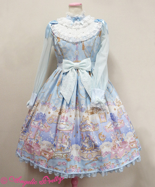
First up is the OP. The bodice seems fairly well fitted and the bodice shape looks okay. The chiffon sleeves look a good length, although I think the cuffs could have been smaller. I think the bows on the cuffs are cute though, with a good shape. However, I think the ribbon bows on the shoulders look really silly. You can't see the bows properly and they just sort of flop down awkwardly. The ribbon used for these bows is super shiny too. There is a belt, which nips in the waist area brilliantly. This belt is topped with a bow, which has a really cute shape. It holds its shape really well and it doesn't seem to droop at all. The main part of the bodice just features some subtle lines of thin lace, because there is a lot of detail on the bib. I really hate the bib on this dress. For starters, I think it is too big, but I also don't feel the look of the bib suits the more cute aspects on the dress, such as the waist bow and the print. It is a shame, because the lace on the bib sits nicely and has been used well, as have the pearls. I do also feel the neck looks too stiff and uncomfortable. The back offers no shirring, so size flexibility is limited. The back does at least look quite neat, with the zip line well hidden and some lines of lace, which matches the front. I suppose the print lines up along the zip line okay, but it could have been better. The stock photos show that the skirt has loads of petticoat room and it flares outwards plenty. There should be the potential to create a really full, sweet shape. The skirt is kept simple in design, so the print is displayed beautifully. The bottom hem is then finished off neatly with a line of cute carousel themed lace.

Here we have the Peplum JSK. The bodice looks really well fitted and the shape is cute. I love the slight heart shaped neckline. The straps seem an okay width. They could have perhaps been just slightly wider, but maybe that wouldn't have suited the style of the dress as well. The straps are lined with gold braid and lace. Personally, I feel the lace could have been shaped better, but I do like the gold braid. The bodice is sort of divided in to 2 halves. The bottom half features 2 ribbon corsets and some gold buttons. The ribbon corsets are kept small and subtle. They don't really grab too much attention, but gives the bodice an extra bit of added texture. The buttons have a pretty design and are well spaced out. The top half of the bodice has some gathered ruffles of lace and some shiny ribbon bows in the middle. The lace is really pretty and it has been layered well, creating an interesting look. I wouldn't have bothered with the ribbon bows in-between the lace at all. The bodice is already very heavy with detail and I don't think the bows are necessary. The neckline is lined with some gorgeous looking rose lace and also some thin gold lace, which works well with the use of gold elsewhere on the bodice. The back is fully shirred, so there is plenty of size flexibility but it also isn't too attractive to look at with all that exposed shirring. The stock photos show that the skirt is very full and it flares outwards generously. There is more than enough petticoat room. And here we are at the peplum part of the dress... I really hate it. The wide lace at the bottom of the peplum looks terrible in my opinion, and it sort of reminds me of granny net curtains. The top part of the peplum doesn't look much better, with the ribbon used to tie it up being very shiny. The ratio of the 2 materials looks off, and it also obscures the top of the print as well. Thankfully, the peplum is detachable, and the dress looks so much better without it. The bottom hem is then finished off with the carnival horse lace again.

This is the Standard JSK. The bodice seems well fitted and the bodice shape is simple, but cute looking. The straps seem to be a good supportive width, although it is hard to tell with all that lace in the way. This wide lace which goes along the straps and neckline is really pretty though. It gives the area a really soft appearance. The lace has an interesting design too and it sits well on the dress. There is a belt, which would have looked good if it wasn't for the ruffled edges. I personally think the ruffles look a bit bizarre and it creates a slightly odd looking silhouette. The waist bow in the middle is cute with a very defined shape. I do think it might be slightly too big though. The bodice has several gathered ruffles, which by themselves break up the bodice nicely. But the middle ruffle is topped with some large, shiny ribbon bows, which I personally think is a bit overkill. In my opinion, the large waist bow and the lacy bow on the neckline would have been enough. The back has a panel of shirring, which is topped neatly with a ribbon corset. The stock photos show that the skirt is quite full and flares outwards well. I like the full bell shape created in the stock photos and think it has a lot of potential. The skirt is kept simple in design, so the print is displayed perfectly. The bottom hem is then finished off neatly again with the carousel lace.

Finally, this is the print. This series comes in ivory, pink, sax blue and lavender. When I first saw this series, I did wonder if the print details would look a bit washed out with all these light colours. But as I write this on the day this series came out and after seeing more photos of the actual dresses, I think this print looks a lot better in reality than it does in the stock photos. The details are definitely a lot clearer. The colour choices are very dreamy and soft, although I would have loved a navy blue version! As for the print itself, it is very cutesy with a lot of sweet themes. The individual carousels are well drawn, with the horses well positioned. I really like how the base and top of each carousel has a different design. The dangling moons and stars are really cute too. But I do wonder if I find the print a bit too cute, if you get what I mean. The fluffy clouds provide a nice way to break up the border and the non-border part of the print. The non-border part of the print is perhaps a little bit more mature looking, although I really dislike the dangling tassels. The roses around the border and the lacy doilies pattern add a slight hint of maturity as well.
So overall, I don't really know what to make of this series. I am really struggling to work out if I like the print or not. I can definitely pinpoint what I like and dislike about it, but perhaps the fact that the carousels are toy carousels are making me think it is a bit too cutesy for my personal tastes. As for the dresses, there are things I would change about each dress, but in some cases these are only small issues. Would I buy this series? Probably not. My top choice would be the Peplum JSK in ivory or lavender, but I would definitely be detaching that peplum. I get the impression that this series is going to be one that grows in popularity as more photos become available, but I wont be rushing out to get it!
No comments:
Post a Comment