Monday 30 June 2014

Print double- Baby and Aatp

Today I am having a look at 2 prints to keep up with all the new releases. Scroll down further to see what I think of Alice and the Pirate's new Halloween print (Yes, really. Halloween in the Summer!)

Firstly, I'm taking a look at Sister Maria's Humming Birds by Baby the Stars Shine Bright. This series includes 5 dresses (3 printed, 2 non-printed), a skirt, a blouse, tights and 5 different hair accessories.


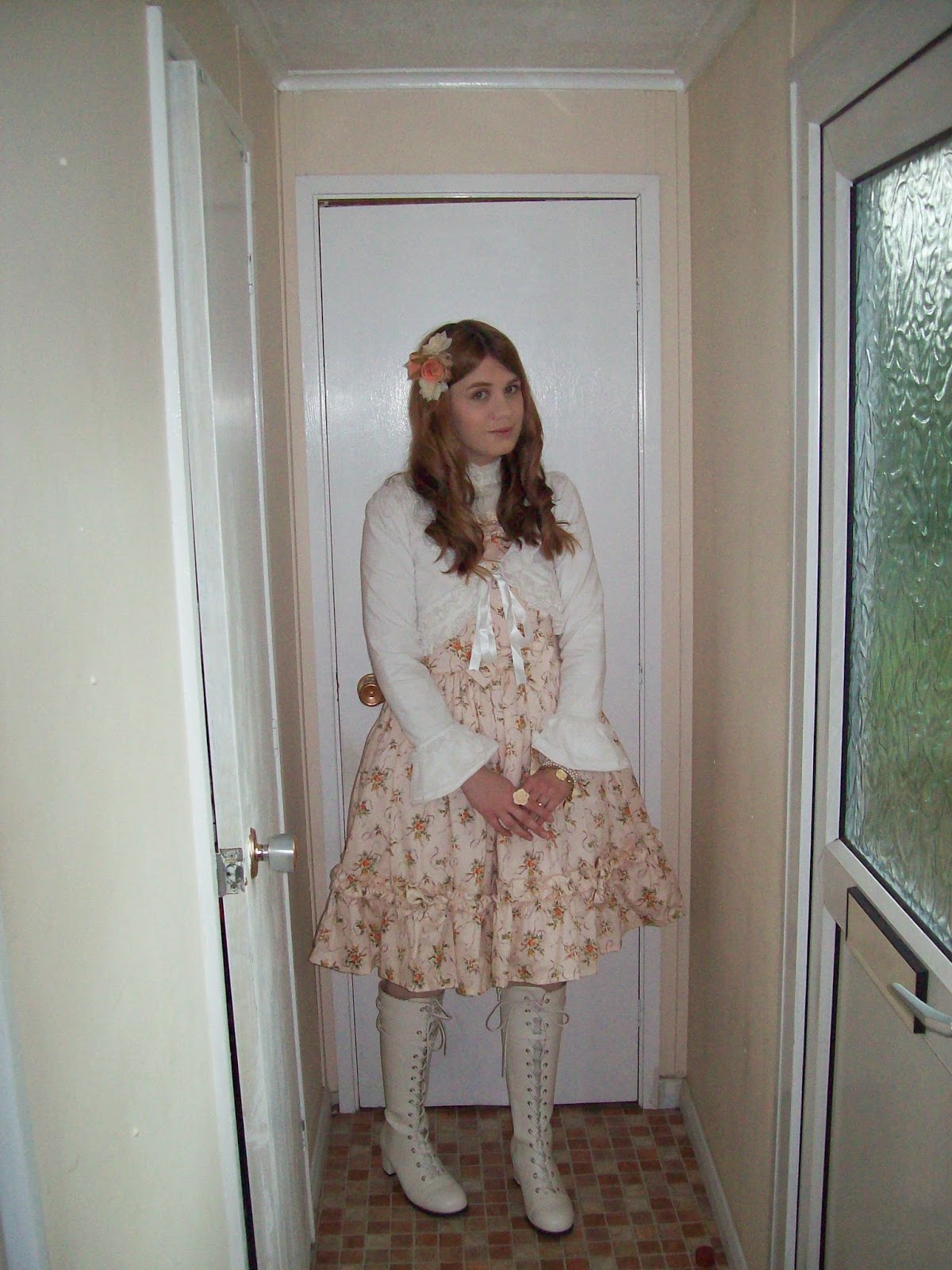
This is the Standard JSK. The bodice looks reasonably well fitted, although the overall bodice shape could have been prettier. It is a bit too boxy and square shaped for my liking and I feel the bodice needs to end higher up. The straps are a good width for the dress but I think they look a bit casual in comparison to the rest of the dress. I feel they could at least do with a little thin lace along the edges to liven them up a bit. The waist area has a stripy belt which helps to emphasise the waist area nicely. The ribbon used for the belt appears to be of a good quality and isn't shiny at all. The bow in the middle helps to finish off the belt cutely. The bow is a good size and shape, and sits well on the dress. The bodice has a ruched panel. I feel the panel needs to be wider and finish lower down on the bodice. As the panel is, it is going to cut awkwardly across the bust area of some wearers. Also, if it finished lower down it may help to fill in more of the plain area of bodice. There is a line of gold lace which sits just beneath the ruched panel which keeps things looking neat, but I'm not really sure it is needed. The neckline has a ruffle of net tulle, topped with gold lace. The tulle looks okay, but I don't think it is the prettiest option. The tulle is gathered well though, and gives the neckline a very soft, frothy appearance. There is a chain of pearls dangling from the neckline, with a cute music note charm in the middle. There is a random line of pearls dangling from one side though, which I think looks a bit out of place. The neckline is then finished off with a stripy bow. The bow size is fine, but I think a smaller bow here would have looked better teamed with the waist bow. The shape is good though, and it sits well on the dress. The back has a panel of shirring, which is concealed neatly with a ribbon corset. The stock photos show the skirt has lots of volume and has the potential to flare outwards loads. The overall shape is very rounded and I did wonder if maybe it was a little too sweet looking for a classic series, but I actually quite like it. The majority of the skirt is kept simple and the print is displayed beautifully. The bottom hem is then finished off neatly with a line of stripy ribbon and 2 gold tulle ruffles. The stripy ribbon is topped with bows and I feel the bows could do with being a bit smaller. The 2 lines of tulle are layered neatly, and give the bottom a lovely soft finish.


Here we have the Long Frill JSK. The bodice seems fairly well fitted. The overall bodice shape is quite simple, although it is a little hard to tell under all that lace! The straps are thin, but seem to be a good width for the style of dress. Whilst I like that the straps are lined with lace, I think the lace is too wide and is a bit overpowering teamed with the rest of the lace on the bodice. I also dislike how this lace is bright ivory, teamed with the gold tulle elsewhere on the dress. The ivory lace looks too harsh and it really sticks out in my opinion. The waist area has a stripy ribbon belt design which helps to nip the waist area in. It uses the same non-shiny ribbon that the other JSK has. The belt is topped with a bow, which is a good shape and size. The bow is also lined with narrow lace, which helps to liven it up and make it look less plain. The front of the bodice has a line of buttons which are positioned nicely and spaced out well. However, I'm not overly keen on the style of button used. The button design is pretty, but I don't think it is the best style for this particular dress. The neckline is finished with gold tulle and a line of gold lace which again, I don't feel is the prettiest it could have looked, but I suppose looks okay. There is also a very wide line of ivory lace. Whilst the lace design is pretty, I feel the lace used is far too wide. I think more layers of narrower lace would have looked better. The wide lace just looks floppy and it droops loads. I would even go as far as saying it looks messy. All of this tulle and lace is then finished off with a stripy bow on top. Whilst the bow is cute, I feel it needs to be smaller in size. I also think that there isn't enough of the stripy ribbon to justify using it on this dress and I would have preferred solid coloured ribbon instead. The back has a generous panel of shirring, which is concealed well by a ribbon corset. The stock photos show the skirt has plenty of volume to create a nice, classic lolita silhouette. I think the skirt shape is a bit nicer than similar dresses we have recently seen from Baby. It has got a bit more shape to it. The print is displayed very well. The bottom hem is finished off with 3 layers of gold tulle. I wish they hadn't attached them over-stitched though, as I think it looks a bit messier than under-stitched. However, the tulle is layered beautifully and it is a lovely, soft way to finish off the dress. 


And here we have the OP. The bodice looks fairly well fitted and the shape is interesting. The sleeves are a really good length. I love the folded over cuffs with gold braid detail. However, I feel the lace on the end of the cuffs is a bit overkill and really isn't needed. The sleeves would look a lot less fussy if that lace wasn't there. The neckline has a sailor style collar, which is very cutely shaped and is a good size too. The gold braid is a nice finishing touch. The collar is lined with lace, which gives it a softer, cuter finish. The collar is finished off with a stripy bow in the middle, with a smaller one at the waist area. Both bows are a simple, but nice shape. I also like that the 2 bows are different sizes and are also both detachable, so you can play around with the positioning to see what you like best. I personally like just the smaller bow attached to the middle of the collar. The rest of the bodice is kept plain, but I think the bodice already has plenty of detail to it. The back does not have any shirring and the waist ties are also very thin, so it may not offer a huge amount of size flexibility. At the back, the sailor collar is divided in to 2 parts. I know understand that it need to be like this because of the zip placement, but I feel the shape of the collat at the back could have been done better. The long skirt is typical of what we have seen from Baby a lot recently. It has a good length to it and has enough volume. The skirt flares out well and the A-line shape is pretty. The main thing here is to make sure to wear the right sort of petticoat. The print is displayed fairly well, although the longer length means there is more of the background and less of the actual print. The bottom hem is finished off with gold braid and then 2 lines of gold tulle. The gold tulle is layered well and looks very floaty. I do feel the line of gold braid needs to be a bit wider though, as it gives the skirt a slightly funny shape towards the very bottom. The tulle is topped with more of the stripy bows. I think the bows could do with being just slightly smaller and placed a little bit further apart. 


Finally, here is one part of the print close up...


...and another part. This series comes in ivory, pink, sax blue and brown. Aside from the sax blue, all the colours are quite muted and soft. I am glad there is a slightly bolder offering with the sax blue and the brown offers a bit of a darker option. My personal favourite is probably the pink though. As for the print itself, I think the musical background spoils the print. Although we can see that the background is meant to be stripy with musical bars, it doesn't look good when it crosses over the top of the pictures. It gives the illusion that the pictures have been printed poorly on some dodgy printer. It would have been better to have the background stop whenever it reaches any of the framed pictures. As for the pictures, I suppose this print must be amazing for Sound of Music fans. It is definitely a new area for lolita and an interesting choice. It sure makes a change seeing this instead of a thousand similar looking Alice in Wonderland prints. It's just a shame that the stripes over the pictures spoil them in my opinion. Here is hoping the pictures actually look a bit clearer in person.

Baby certainly seem to have found a style of dress they love and something tells me they will be sticking to this style of dress for a while. Overall though, I feel this particular series is a lot weaker than other recent offerings. The dress designs look okay and I would only make the odd tweak here and there. But the print is a bit of a disappointment in my opinion. I really hope it looks better in person than it does on the website. So this is not a series I would buy. If I had to though, I would choose the Standard JSK in pink. I feel this series could have been a lot better than this.

Today I am also looking at Guilty Meltin' Sweets Town by Alice and the Pirates. The series includes 2 dresses, a skirt, a vest, 2 blouses, pants, 3 hair accessories, a necklace, a hoody and some socks.


This is JSK I. The bodice looks well fitted and the shape is lovely. I'm not sure about the dual set of straps though. The halterneck tie straps look a bit too thick and the normal straps are very thin and look a bit flimsy. If AatP insist on having 2 sets of straps then I would have made the halter straps much less bulky looking. But to be honest, I would have just had one set of regular straps and just made them slightly thicker. The neckline has a line of wide lace, topped with 4 ribbon bows. The bows are all different shapes and sizes, but they all match up well with the rest of the dress. All 4 bows are cutely shaped and are positioned on the dress. I especially like the bows with gold detail. The ribbon used is a little shiny though. Four bows may seem a little excessive, but judging by the rest of the dress, it is meant to be OTT. I can't say I am a fan though. There is also 2 lines of chain dangling from the bows with a cute star charm on the end. I feel the top line of chain with the pearls is a bit too taut and needs to be a bit longer. Otherwise, I think the chain is a nice idea. The back has a panel of shirring which is concealed by a ribbon corset.


I really don't understand the random side bustle on this dress. It is only on one side, which gives an interesting asymmetrical look, but I don't think it has been executed well. Firstly, I don't like how narrow the bustle is. Secondly, I feel the tiers don't fall nicely and don't sit well on top of each other. It sort of looks a bit bunched together and the design doesn't flow well. Also, I feel it would have been better to stick to one colour instead of alternating. It just sticks out and looks awkward. I am not saying a side bustle is a bad idea, but I don't think this particular one has been thought out that well.

Apart from the side bustle, the skirt is otherwise a very pretty shape. It has lots of volume and flares out well. It will accommodate plenty of petticoat. The print is also displayed really well. The bottom hem is then finished off with wide lace. I personally would have liked the lace to be a bit more narrow, but I suppose it does match up with the wide lace on the neckline.


This is JSK II. The bodice looks very well fitted and the shape is very interesting. I love the bat shaped straps! The straps are a good width and the shape has been executed so well. The folded over bat collar sits nice and flat and it finishes well to make a good neckline. It may seem a bit too costume-like for some, but I am impressed. The bodice has a tuxedo like design which works surprisingly well with the bat-like details. The dropped waist line does look a bit bumpy, but apart from that I love the tuxedo design. The simple buttons are spaced out fairly well. The back is fully shirred, which means there is nothing to conceal the shirring. It does offer a good amount of size flexibility though, and the shirring looked less obvious on the darker colour ways anyway. The skirt shape is not as pretty as I had hoped though. The waist line probably has affected the skirt shape. I feel a skirt shape a bit more like JSK I would have been nice here. However, it still seems to have a reasonable amount of volume and with the right petticoat it will probably look a lot better than the stock photos. The skirt design is kept simple, so the print is displayed beautifully. The bottom hem is then finished neatly with thin lace.


And here we have part of the print close up. This series is available in ivory, red, navy and black. All four colours are very good choices for a Halloween themed print. However, there are a few colours in the print which some lesser experienced lolitas may struggle to co-ordinate. The navy blue is probably the safer option. I personally really like the ivory colour. As for the print itself, I think all the houses are drawn brilliantly with plenty of detail. I adore the warped chequered floor too. The cat shaped lollipops are cute and are an interesting object in this very bizarre print. I like how everything is bent and warped. The one thing I don't understand though, is the random chandeliers. I don't think they are bad, just a bit out of place.

So overall, I think this is an interesting Halloween themed series (although it seems AatP release their Halloween stuff earlier each year). However, I do wonder if for some people the dress designs will seem a bit too costume-like. Also, there seems to be a conflict between more darker, gothic elements and cutesy elements. I think this is a series that people are either going to love or hate. This series is not to my taste, but I am impressed with the design for JSK II. So if I had to buy this series, I would go for that dress in either navy blue or ivory. In my opinion, JSK I just looks messy in comparison. I expect this series will be popular with certain lolitas though and will probably sell out fast.

Thursday 26 June 2014

Craft Project Mission in Oxford!

Last weekend a few friends and I decided to have another casual meet in Oxford. We decided to walk up to Hobbycraft because all 3 of us were looking for crafting bits. I am trying to get my outfit for the September Tea Party Club event sorted as soon as possible and the outfit I want to wear involves a lot of crafting. Despite the hot weather, it also seemed a good excuse to wear lolita!


I decided on Sugary Carnival by Angelic Pretty. I obtained Sugary Carnival a few months ago and I was shocked by the lack of things I had to go with it. I thought my wardrobe was finally at that stage where I had plenty of basics and accessories, but this dress has proved me wrong! So this is something I am planning on working on once the TPC event is out of the way and I have a bit more money to raid the Japanese auctions.  As you can probably tell, this outfit was me just chucking on whatever matched the dress the best. I feel the outfit is a bit too casual looking for Sugary Carnival and I am intending to do a more fancy outfit with it as soon as possible. Sammi very kindly made me the head bow for this outfit, which I chose the material for. I spent ages finding the perfect pink and settled on a shade which matched the little mini bows at the bases of the straps. 


Before we embarked on our walk to the retail parks out of town, we decided to refuel with food first. We ended up in Zizzi's, which is unusual for us as we don't often go to Italian places with the Oxford group. The food was really nice, although the tables were ridiculously tiny and we could barely move! Shalisa and I shared a Sofia pizza as we both thought it looked nice. The chilli peppers were a bit hot, but otherwise I enjoyed it.


After going to Hobbycraft (which was partly successful, but I still need to ebay some bits) we looked around the other shops in the park. We ended up in Toys R Us where we found this hilarious looking Spyro costume! I don't think this picture really shows just how awful this costume looked in person! The mask was creepy.


After Toys R Us we went in to Pets at Home to look at the cute animals. I'm so glad I am not the only person who visits pet stores just to look at the cute animals and not actually to buy anything! I fully approve of the store's choice of fish tank accessories. If I had pet fish I would definitely decorate the tank with Spongebob toys.


After shopping, we went to G&D's for ice cream and once again, they didn't have my favourite Oxford Blue flavour! However, the Black Beauty flavour I got was very nice. And the portion sizes were once again very generous.


Shalisa wore her Meta poodle dress with a hair accessory from her shop Sugar Trampoline. She looked very lovely and retro!


Sammi did a lavender and yellow combination with Angelic pretty pieces. Can you believe she found the skirt for only £14? I am very impressed with Sammi's cheap auction finding skills.


To finish the day we went to the pub, where Sammi and I shared a pitcher of Pimms and lemonade. Pimms is seriously one of the best alcoholic drinks ever and it tastes even better when the sun is shining.

So it was a very busy and hot day, but definitely worth it! I love spending time with Shalisa and Sammi (and James too, of course!) and love it when we have our little catch-ups like this. And here is hoping our craft projects are successful too.


Monday 23 June 2014

Crystal Dream Carnival by Angelic Pretty

Today I am taking a look at Crystal Dream Carnival by Angelic Pretty. This series includes 3 dresses (one is a dress, choker and bonnet dress set), a skirt, a head bow, socks, a blouse, wrist cuffs and gloves. Some of the accessories have yet to be released by AP at the time of writing.


This is the Tiered JSK. The bodice looks well fitted and the overall bodice shape is very interesting. The diamond pointed neckline is certainly a bit different. The straps are a bit on the thin side, but bulky straps would not work with this style of dress. The straps have these beautiful detachable tulle shoulder parts. The tulle is shaped well and it drapes really nicely. Even the little straps with the star buttons used to attach the tulle are cute looking and full of detail. Although the tulle parts are detachable, I feel the dress looks so pretty with the tulle shoulder parts attached. There is a waist bow, which is a bit big but seems to suit the dress. The bow is a really pretty shape. I wouldn't have bothered with the star lace running through the bow, as it blends in a lot anyway, but the gold lace used around the edge of the bow is a nice finishing touch. The hints of gold give it a real luxury feel to it and it has been used so neatly too. The waist bow is also very perky looking and sits boldly on the dress. The bodice features a bold, gold braid diamond pattern. The diamonds are spaced out well and the design just fits in so well with the rest of the dress. I like how the corners of the diamonds are topped with pearls too for that added extra bit of detail. There is also 2 lines of wide lace on either side of the bodice which blend in quite a lot, but help to give added detail to an otherwise plain part of the bodice. At the top of the bodice, the gold braid forms an outline around a neckline bow, topped with further pearls and dangling crystals. It all fits in so beautifully and has been done neatly. The only thing I would change is I would make the neckline bow a bit smaller. The back has a panel of shirring, which is concealed very neatly be a ribbon corset. The stock photos show the skirt has more than enough volume and flares out beautifully. There is more than enough room to create an OTT shape. The overall shape is so lovely. The skirt is split in to tiers, but the tier join has been done so neatly, that you barely notice its there. The tier join is topped with a line of lace, which blends in well and sits perfectly on the dress. The main feature of the skirt is that beautiful tulle overlay. The overlay is so soft looking and well shaped. The tiered design and gathering give the tulle overlay plenty of volume and I really love the way it sits on top of the dress. The lace along the edges is kept simple, which I think is the best option. The end result is so pretty. I especially like how you can't really see where the tulle overlay attaches, as it has been executed so neatly. I definitely prefer this dress with the tulle overlay attached, but it is detachable if you wanted to wear something a bit simpler. I really like how you can detach all the tulle parts on this dress and play around with how OTT you want to go. The bottom hem is then finished off with pretty carnival horse themed lace.


This is the Regular JSK. The bodice looks very well fitted again. The bodice shape is simple, but looks interesting enough. I like the heart shaped neckline. The straps are a good width for the style of dress. They are also lined very neatly with thin gold lace, which stops them looking too plain and just generally looks more luxurious. The waist is topped with a bow. I think the bow size is good, although I am a little unsure about the shape. The shape sort of makes the bow look like it has been stretched outwards. It does sit well on the dress though, and the gold lace lining keeps the dress details consistent. I really love the panel of fabric sitting on top of the skirt, which continues up on to the bodice. The part around the waist area is such an interesting shape and the gold braid lining it has been done so neatly. The gold braid hides beneath the waist bow and then continues up on to the bodice. The shapes created on the bodice are so pretty and really different. The design has been so well thought out. The solid coloured part in the middle of the bodice looks a bit plain in comparison to the rest of the dress but it does serve as a nice contrast to the rest of the bodice and really highlights the interesting lines and shapes. The centre of the bodice has 3 cute looking star buttons running up it, which are well spaced and help to fill in the empty solid part without overdoing things. There are also 2 thin lines of gold lace running up the bodice, which reach 2 star shaped buttons at the base of the straps. This detail doesn't really stand out too much, but again helps to make the area a bit more interesting and not so flat. The back has a panel of shirring which is concealed neatly by a ribbon corset. The skirt has a beautiful full bell shape to it and it is great how the waist details sit so well on top of it. The skirt flares out beautifully and has plenty of room to hold lots of petticoat. Aside from the waist area, the skirt design is quite simple and the print is displayed brilliantly. The bottom hem is then finished off with the pony lace again.


This is the OP which is part of the dress, choker and bonnet set. I wont go in to much detail about the choker and bonnet, but let's just say I feel the bonnet is a very good match for the dress with plenty of detail. I'm not that fussed by the choker though. As for the dress, I feel the bodice is generally well fitted but it looked like some of the material was a little baggy around the sides in some of the stock photos. The overall bodice shape is okay, but I personally think it is a bit frumpy looking. The sleeves are an interesting length and I think they have a suitable amount of puff for the style. I really love the use of lace running down the sleeves and then how it is layered at the bottom of the sleeves. The lace is layered so well and it adds so much detail. I'm a little unsure about the tulle parts on the shoulder though, as I feel they make the shoulders look wider and draw attention to them. The bodice is divided up by the use of gold braid, giving the bodice a panelled look. It keeps the waist area looking crisp and neat. The shape of the waist line is interesting looking as well. The gold braiding is again used to create interesting shapes on the bodice. I am very impressed by how neat the braid lines look. The neckline has a solid coloured panel and the line of braid lining this panel is topped with pearls. The pearls are a really good finishing touch. The solid coloured part is topped with more of the cute star shaped buttons, which are spaced out tidily. I love the deep heart shaped neckline and the lace used along it gives it a softer appearance. Lower down on the bodice, there are 3 bows running down the centre. The bows are a good shape and the spacing is good, but I feel they could do with being a bit smaller. These 3 bows are not lined with gold lace, but I think that would have been too OTT in this case anyway. The bodice is finished off with a detachable chain that attaches by the shoulders. I think the chain is cute but could do with being just a tiny bit shorter in length because in some photos, the chain was a bit obscured by the neckline. The back has a panel of shirring which is concealed well by a ribbon corset. Like the tiered JSK, this OP also has a tulle overlay. The overlay design is essentially the same, although I don't feel it works as well as it does on the JSK. I don't think it sits as nicely on top of the dress and looks a little bunched up. I also don't think with the OP you have the option of detaching the tulle overlay, which is a bit limiting. But the one thing the OP does have over the JSK is that you can see a bit more of the print underneath. From what we can see of the skirt underneath, the shape looks pretty and full. The skirt flares out well and has loads of volume. The skirt is tiered and like the JSK, the join is hidden neatly with a line of lace. The bottom hem is then finished off with a line of tulle, but I personally prefer the pony lace on the JSKs.


And here we have the print close up. This series is available in navy, pink, lavender and blue. Unsurprisingly, both the blues have proved far more popular than the pink and lavender. There is just something really magical about the navy colour. The lavender is okay, but I feel the pink is very obviously the weakest colour way for this series. As for the print itself, I think it is beautiful! Yes, it is another carnival horse themed print, but I feel it is different enough to keep people's interest. The ponies in the print are drawn so well. I especially like the way the pony manes have been coloured and how the tails have that curled shape. Even their saddles are full of detail. The use of gold is very bold and is not for the faint hearted. The diamond background is very eye-catching too.

So if you are a fan of OTT Angelic Pretty, this series is probably a winner. They may overuse the carnival theme, but AP know what their fans want and they have delivered a really strong series. I especially like seeing a carnival print with darker colour ways. Would I buy this series? Yes, I would and it has been on my wishlist since I first saw the Kera scans. Although I am not going to get my hopes up about actually obtaining it! My top pick is the Tiered JSK in navy. I actually gasped when I first saw that dress design and that doesn't happen very often. It is really not surprising to see this series is already causing a huge bloodbath and I expect to see this series sell above retail price for quite some time. The carnival hype shows no signs of dying yet.

Thursday 19 June 2014

Lady Sariel Over-skirt Review

I have been looking at new ways of adding extra layers to my outfits recently and I thought that a chiffon over-skirt may be a nice addition to my wardrobe. Lady Sariel offers quite a cheap chiffon over-skirt and they looked pretty in the pictures, so I thought I would give them a go.

Ordering

To order from Lady Sariel, you have to send her a message through her Facebook page. Search for Lady Sariel on Facebook and you should be able to find her page quite easily. I sent Lady Sariel a message and she responded very quickly, so her communication was good. I gave her the measurements she needed (waist and length) and soon after, she was making my 2 over-skirts. The whole process was very quick and my items were soon completed in less than a week.

Shipping

I sent my address around the 9th of June and my package arrived on the 14th of June. I think this is a reasonable amount of time for a package coming from mainland Europe.


My package was sent in a very sturdy plastic mailing bag, which was sealed very well. My items were very secure inside and I had no worries about the items inside being damaged during transit.


Inside the outer packaging my over-skirts were wrapped together in another plastic bag.


Two over-skirts worked out at roughly £42 and are cheap in comparison to similar products available. The materials used are average, but considering the price I think what is used is fairly reasonable. The sewing is fairly neat, just looking a little bit messy near the ends of the ribbon belt. I was a little surprised that the belt was made of ribbon, as it is not a very stretchy material. I deliberately added a few centimetres to my waist measurement when I ordered and it is important to do so, otherwise the over-skirts will not fit. The over-skirts have a simple clasp, which is easy to do up.


The chiffon used is not the nicest I have seen, but feels very soft. The skirt has a good shape to it although the edges are a bit rough. I really like the way the material is gathered and how it falls down though.


And here are a few worn photos of my black over-skirt. 


I am very impressed with the way the skirt looks from the side. In this photo I think a slight gust of wind had caught the skirt. I think it adds nice movement to the outfit.


Another side shot, this time when the wind wasn't blowing. The over-skirt sits very nicely on top of the skirt. It is so soft and delicate looking and I think it creates an interesting silhouette.

Overall, I think that the end product is worth the cheap price. With my 2 over-skirts working out at £21 each with shipping included, I think what I got was what I expected. The materials could have been better but you get what you pay for. I have to say, I am very impressed with the shape it creates though, and I love how soft the chiffon is. Lady Sariel was very pleasant to deal with too. So I would say that this is a positive experience and I would recommend Lady Sariel. 

And if you are curious to see what my full outfit from this post looks like, you can see it on my Lookbook here- http://lookbook.nu/look/6310805-Black-Tiered-Veil-Claires-Accessories-Rose-Clips 

Monday 16 June 2014

Patisserie Dream by Metamorphose

Today I am having a look at Patisserie Dream by Metamorphose. This series includes 3 dresses, 2 skirts, a blouse, 2 hair accessories, socks and a pair of wrist cuffs.


This is the Shirring Pinafore JSK. The bodice seems an okay shape and looks fairly well fitted. The straps are generous in width and look very sturdy, although I dislike the shape with the narrower base. The strap bases are topped with ribbon bows. The ribbon used is too shiny for my liking and I feel the bows are too big in size. The shape is cute though. I also think the colour of the ribbon is slightly off (maybe it is just the blue colour way?) and really stands out. The bodice material is fully shirred, which seemingly works quite well. It doesn't stand out or look as unattractive as full shirring usually looks. The thing that really bugs me about this dress is the organdie corset topping the waist area. Whilst I feel this sort of detailing can work well on some dresses, I feel this skirt overlay looks really out of place on this particular dress. It looks fussy and overcomplicates things. The organdie corset itself is also not that appealing. I don't understand why it has been lined with white lace and the ribbon corset part is a shiny mess.


Here we can see what the dress looks like with the organdie corset removed. I feel this is a massive improvement. It looks a lot simpler, but I think this may be a good thing. Admittedly, the waist area is not that attractive but I still prefer this over the organdie corset. Maybe a wide belt with a cute design would help to disguise the waist though.

As the name suggest, the back is fully shirred too but again I feel the shirring blends in quite well with the design. The organdie corset and waist ties make the dress look very messy and crowded, but hopefully with the corset detached it wont look as bad. The stock photos show the skirt is very full and it flares out really well. It has plenty of volume and has a brilliant rounded shape to it. With the corset detached, the skirt is quite simple and the print is displayed very well. The bottom hem is then finished off with cute lace which matches the rest of the dress well. 


This is the Lace Up Pinafore JSK. The bodice is very well fitted. Generally, the bodice shape is nice, although the neckline looks a bit too straight and square with the bib attached. I think it could do with being a little softer. The straps are a decent width. They are also lined very neatly with lace, which stops them looking too plain. The lace then continues along the scoop neckline. The lace used is very cute and heart shaped. As I have already mentioned, the bib part of the bodice is detachable. I personally prefer the dress with the bib detached, although the scoop neckline may sit awkwardly on some wearers. The bodice looks a bit plain, as if it is missing something with the bib detached. However, the bib does have a detachable bow so maybe the bow could be put to good use to liven it up a bit. The bib itself is quite simple with a ruffled design and I feel it looks a bit too basic. The detachable bow on top of the bib looks too big for where it is located in the stock photos. As I said, I would detach the bib and then I feel the bow would look better placed elsewhere on the remaining bodice. The bottom part of the front of the bodice has a ribbon corset. The ribbon is again very shiny but it is spaced out well, without looking too crowded. The pearls at the end of the ribbons are a nice finishing touch too. The sides of the ribbon corset are lined with lace and overall, this part of the bodice has been carried out very neatly. The back has a panel of shirring which is concealed very neatly by a ribbon corset. The skirt is again very full with more than enough volume. It will hold plenty of petticoat. The skirt has a full, rounded cupcake shape which looks very cute. It flares out very well. The skirt design is kept simple and the print is displayed brilliantly. The bottom hem is then finished off with cute lace.


And here we have the High Waist Pinafore JSK. Although this is described as a dress, an apron style skirt would probably be more accurate. The bodice doesn't really have a back to it! The bodice shape is interesting, although I don't think it would suit a wearer with a larger bust. I imagine it may sit strangely on some. The straps are a good width. They have been kept very simple, although it doesn't look too plain on this dress for some reason. The straps cross over at the back before they join the skirt, which is quite cute. The waist has a belted look design. It really helps to make the waist look smaller, although I did notice in some of the stock photos that the material used looked a bit wrinkly. The belt is topped with a bow. This detachable bow is a bit on the big side, although I personally felt the dress looked better with it attached. I think it helps to pull the design together. The bow shape is simple, but cute and it sits well on the dress. The folded collar design is cute. The collar itself is a good shape and size for the dress. It has been done very neatly and the thin lace finishes off the edges well, without looking too fussy. The bodice is then finished off with some really cute candy shaped buttons. It is a shame these buttons appear to blend in to the background so much, because they are adorable. The stock photos show that the skirt has plenty of volume and flares out well. The shape is suitable for a high waisted dress and I can imagine the wearer being able to create a very cute shape. The skirt is kept simple, so the print is displayed very well. The bottom hem is then finished off with pretty lace. 


Finally, here we have part of the print close up. This series is available in black, cream and blue. The blue is not your typical sax blue and I really like it. The deeper blue colour really stands out and the print details pop on this colour, so I think the blue is probably my favourite from this series. All 3 colours seem to work quite well with the print though. As for the print itself, it is a very cute offering. The cakes look so cute and I love the brightly coloured sweets. It is also interesting trying to spot all the different ways that Meta have included their infamous swans in the print! I think my personal favourite is the choux pastry swan that appears amongst the smaller items floating in the background of the print. The really big swan in the print does look slightly out of place though and I think Meta missed a trick not including a swan shaped meringue. The macarons and cookies help to fill in the gaps between the bigger print items and the piped icing at the bottom is a cute way to finish off the bottom of the print. The bows and ribbons are very bold and are a nice finishing touch. I even think the stripy background works surprisingly well with this print.

So whilst there are a few small things I would change about the dresses, I actually think this is quite a strong series. And to be fair, most of the things I dislike about the dresses are things which are detachable anyway. The print is very cute too. Would I buy this series? Possibly. It wont be going on my wishlist but I would be happy to own it. I think if I were to go for this series I would choose the High Waist Pinafore JSK in blue. I really hope this series does well for Meta.


Thursday 12 June 2014

Berkshire Lolitas Summer International Lolita Day 2014 Meet!

I hope everybody had a lovely International Lolita Day last Saturday! I spent my ILD with the Berkshire Group in Reading. We were meant to have a picnic but unfortunately the weather forecast was awful!


I had a bit of trouble with my outfit. I knew it was meant to rain, but it was also meant to be really hot and humid. In the end, I had to wear whatever went the best with my Bodyline boots (Which I really need to break in properly. They were VERY uncomfortable and I am praying they get more comfortable after a few wears, otherwise I wont be getting the black ones after all). I feel I look a bit plain and simple, but it was important that I was able to wear things I could easily take off if needed. In the end, it was really hot and sunny all day, so there was no need to wear my boots! Typical! I curled my hair (too hot for a wig) and it all fell out not long afterwards. But aside from weather troubles, I don't think I did too badly? I wore my Meta lucky pack dress, which has served me quite well as one of my more casual brand pieces. Everything else is either Bodyline or off-brand.


The Forbury Gardens were in bloom and it looked lovely, although a few of the roses were a bit dead! We had to angle our photos very carefully to choose the best flowers. This rope area is in the middle of the gardens and it looks amazing when the flowers are out.


A lovely group of lovely lolitas! I met a few new people and saw loads of fantastic lolitas again. It is a shame I don't have any photos of us with Fern, Charlotte and Becky, who met us all a bit later on. We were able to get lots of photos before our mid-afternoon lunch.


We then went to Wagamama's again. It was a shame we couldn't have the picnic, but I was very satisfied with my curry! I had what James had last time, because I remember sampling his and getting food envy! Curry may seem a bit of an odd choice for a hot day, but it tasted amazing.


We also got given goody bags. We were all very happy with them! A massive thank you to Fern, Charlotte and Rosa for making them.


We also had another of Shalisa's quizzes to fill out and I ended up getting first place again! We had to guess whether or not the names were real brand print names or false ones. Considering I love discussing brand releases on here, it would have been embarrassing if I hadn't done well! Although, even I was a little surprised by some of the brand names on there. I don't think a single person guessed right that there was a print called Ruby Gloom. 


We went back to the park to eat the cakes that Rhiannon had made. They tasted amazing! I wish I had saved room for more. There were loads of interesting flavours, including elderflower. I kind of regret not trying one of those ones. And then Sammi, Shalisa and I left early because we needed to get some supplies in town.

I am very glad that I got to celebrate ILD with friends. I haven't really properly celebrated ILD at a meet before, so it was fun to mark the occasion. And although my boots caused me a lot of pain, I was grateful for the lovely sunny weather.

Monday 9 June 2014

Starlight Carnevale by Alice and the Pirates

Today I am looking at Starlight Carnevale by Alice and the Pirates. This series includes 3 dresses, a skirt, 2 hair accessories, 2 pairs of socks, a few pieces of jewellery and a hair clip.


This is JSK I. The bodice looks well fitted. The bodice shape is interesting, but I feel the scoop neck goes too low and wont suit as many wearers. But it would look lovely teamed with a fancier blouse or neck piece. I feel the straps could have been slightly thicker as it would look a bit better balanced. The front of the bodice has a ribbon corset. The ribbon used is slightly shiny but otherwise looks fine. I think the ribbon spacing looks well done and not too bunched together or crowded. The corset is topped with a large ribbon bow. The bow has a beautiful shape to it and it is lovely how the solid ribbon is layered with sheer gold patterned ribbon on top. The size is a little big but it really suits the dress. However, if you dislike the bow it is detachable. Aside from the low scoop neck, my main criticism with the bodice is the gold lace used to line the neckline and inside of the straps. I find this gold lace to be very cheap looking. The back has a panel of shirring which is concealed neatly with a ribbon corset. The stock photos show the bell shaped skirt has plenty of volume and flares outwards nicely. The overall shape is lovely. The skirt is kept very simple, so the print is displayed very well and is the main focus. The bottom hem is finished off with pretty gold lace which is much nicer than the neckline lace.


This is JSK II. The bodice shape is cute. It generally seems well fitted, although in some of the stock photos the material looked a bit baggy in places. The straps are very thin and kept plain. I feel they could do with being a little bit thicker, but not by much.


The main area of bodice is kept plain and so the focus is on the heavily detailed neckline. The dress would probably look too OTT with a waist bow but maybe a thin belt would have livened things up a bit without being too distracting? However, the neckline is very pretty. The 4 bows at the base of the straps add a lot of interest. Four bows may seem a bit excessive, but they are made of very soft, floaty ribbon. They sit nicely on the dress and are positioned well, so I think the dress looks fine with 4 bows. I feel the really pretty thing here though, is the lace used for the neck line. The lace used is heavily detailed but the details are crisp. And the pearls hanging from the lace are pretty too. The pearls are a good size too.

The back is fully shirred, which means there is nothing covering it up. Great for size flexibility, but maybe not as appealing to look at. The stock photos show that the skirt has a lovely shape. It has a good length to it too. It looks like it has plenty of volume and flares out well. The skirt details are again kept simple, so the print really does stand out. The bottom hem is then finished off very neatly with more of the pretty neckline lace.


This is the OP. I was really disappointed when I saw the bodice shape in the stock photos. Something about the shape just doesn't look right to me. I can't quite figure out why that is! The lower waist line with the V shape doesn't look very appealing either. The sleeves are a good length but I feel could do with being just a tiny bit puffier to make them look a bit less lifeless. The sleeves are finished with lace and ribbon bows. Whilst the sleeve bows are very pretty, I feel they need to be a lot smaller and add too much bulk. The lace on the sleeves is also a bit wide, but at the same time it does match the dramatic looking lace on the bodice.


I have very mixed feelings about the OTT lace on the bodice. The neckline lace itself is nicely detailed and of a very good quality. It also sits well on the dress. However, it also feels very fussy looking and a bit frumpy. I am also not sure I like that neckline shape. The neckline is finished off with a large ribbon bow. It is done in the same way as JSK I with the 2 different ribbons layered on top of each other and the bow shape is again very pretty. However, I don't feel this bow sits very well on the dress where it is positioned. It also looks a bit too big. The neckline lace makes such a big statement already that maybe the ribbon bow is not needed at all. I would also lose the 2 lines of lace running down the bodice to the waist line. They just don't seem to work.

The back of the bodice has no shirring and looks very plain. The skirt shape is very pretty, but I feel the waist line spoils it a bit. However, it has plenty of volume to it and should hopefully flare out quite well. The skirt part is fairly simple, so the print is displayed well. The back of the skirt has a chiffon bustle. The bustle tiers are a good size and well spaced out. The tiers are layered well and the softer material means it should hopefully not add too much volume to the wearer's bottom. The bottom hem is also finished off with a simple chiffon ruffle.


And here we have part of the print close-up. This series is available in sax blue/orange, navy/pink, black/purple and red/black. The combinations make for some interesting coloured skies. I personally found the colours of the sax blue and orange version didn't flow and blend together as well as the 3 other colour ways. My personal favourite is definitely the navy/pink version because it makes for a pretty twilight sky, although the black/purple is definitely a close second! As for the print itself, I love the buildings because I feel they have been drawn really well. The river and the street are also lovely. It reminds me of a painting I saw in a gallery once. I am a little uncertain about the characters in the print though. The masked cats look a little out of place next to the more human looking figures in the print. The clothing and masks the characters are wearing though are very pretty. I like the starry background and the way it introduces golden accents in to the print. However, I feel the confetti flying everywhere spoils things a little.

I really don't know how I feel about this series. The print is very pretty but I doubt it is something I would wear. The colour combinations may be a bit overwhelming for some people's tastes. This series probably wouldn't be a good option for a less confident or beginner lolita. As for the dresses, I was a little surprised by how casual the JSK designs are but actually, I think this may be for the best. I think the JSKs would look lovely teamed with one of Baby's more OTT blouse designs. The OP offers a slightly more dramatic option but I am really not a fan of that dress design. Would I buy this series? No, I probably wouldn't. I would go for JSK I in navy/pink if I did. I feel this series had a lot of potential but in the end, I am not convinced by the final product.

Thursday 5 June 2014

Take a Theme- Toys

I had a request sent to me to do a Take a Theme post on toys and I shared some links with them privately. I had quite a few other links left over though, so today I will be sharing a few of my favourite toy themed items with you all! I tried to pick items that maybe people didn't think about straight away. When I think of toy themed outfits I think of Angelic Pretty's toy themed tights or those bear hats that Minty Mix used to make. I did a bit of digging around some of my favourite shops to see what I could find.

Potential sub themes for toys- teddy bears, childhood, nostalgia, fluffy or soft textures

Brand prints of note- Melody Toys, Toy Parade, Toy March (Angelic Pretty), British Bear, Museum Bear (Innocent World), Candy Star Rabbit, Toy Box (Metamorphose) or anything featuring BABY's mascot Usakumya


Unfortunately a few of the items in this post have since gone out of stock but I think they still reflect my personal choices.

I was aiming for something a little bit different from the common pastel offerings you get from brands such as AP. So there are a few brown tones in there and even some golden items to offer a bit of variety. It was also a goal of mine to make sure the entire post wasn't dominated by teddy bears so there are a few other popular toys in here. I especially love the rubber duck ring! The chess board bag offers something a bit more classical and I can imagine the Chocomint bear clip matching many Innocent World dresses.


Monday 2 June 2014

Collection Douce Chocolatier by Baby the Stars Shine Bright

Today I am looking at Collection Douce Chocolatier by Baby the Stars Shine Bright. This series includes 2 dresses, a skirt, a head bow, a bag, socks and many items of jewellery.


First up is the Truffe de Lait JSK. The bodice seems fairly well fitted. The bodice shape is simple but cute. I think the straps are a very suitable width for this dress and look very sturdy. They are also very neatly lined with thin lace, which stops them looking too plain but also doesn't add too much bulk to them. The bodice has a ribbon corset running down the front. I think the ribbon is spaced out very well, without looking too bunched together. The sides of the ribbon are concealed by cute heart shaped lace as well, so the end result is very neat and tidy. The ribbon used doesn't look shiny either, which is a bonus. The neckline is finished off with good quality lace and then topped with a very detailed ribbon design. The ribbon bow on the neckline is a bit big but doesn't look too OTT on this dress. I would have preferred it to be slightly smaller though. The same matte ribbon is used for the bow, but this time some shinier polka dot ribbon has been laid over the top. I personally am not a fan of the polka dot ribbon and would have preferred just the solid coloured ribbon. I don't feel there are enough polka dots elsewhere on the dress to justify its inclusion. The bow shape is very cute though and I like how the neckline has a line of folded over ribbon to finish it off. The folds in the ribbon give the ribbon some extra movement and make it look a bit less flat. The only thing I dislike about it is the way the ribbon abruptly ends at the sides of the dress. The back has a panel of shirring which is concealed neatly by a ribbon corset. The stock photos show the skirt has plenty of volume and it should flare outwards quite nicely. The skirt has a good length to it as well. It will be able to hold a very good amount of petticoat underneath. The subtle roundness of the skirt is cute too. The skirt design is kept quite simple and so the print is displayed beautifully. The bottom hem is finished off with a line of ribbon and some pretty lace that Baby uses quite a lot. The ribbon at the bottom helps to tie in with the ribbon on the bodice as well, making the dress appear more balanced.


This is the Praline JSK. The bodice looks well fitted. Although I generally like the bodice shape, I dislike the way the dress is shaped around the underarms. The straps are a bit on the thin side and I think they could do with being just the slightest bit thicker. The straps are lined with lace on the outside which gives the straps a cuter, softer appearance. The waist bow is a bit of a peculiar shape. I think the shape of the bow gives the illusion that the bow is drooping. The lace on the waist bow looks a bit fussy and I dislike that floral shaped lace has been used when flowers barely feature in the series. The way the bow sits on the dress is also a bit weird. To be honest, I feel the dress design would be strong enough to work without a waist bow there at all. Thankfully, the waist bow is detachable and that is what I would do if I got this dress. The top of the bodice has a weird panel, which is lined with lace. I don't think the panel is really the right shape. The neckline is finished off with floral looking lace and again, the lace is pretty but I'm not sure this is the right lace choice for this particular dress. However, I do like the solid coloured bow that tops the neckline. The shape is simple, but cute. It also sits very well on the dress. The back is fully shirred and so that means that there is no ribbon corset to conceal it, but because of the style of print I think the shirring doesn't stand out as much anyway. The stock photos show the skirt is very full with plenty of volume. The wearer will be able to create a very cute shape. I love the full, rounded bell shape. The skirt is again kept simple and the print is displayed wonderfully. The bottom hem is then finished off with some good quality lace.


And finally, here we have the print close up. This series is available in pink/red, mint/pink, sax blue/navy and beige/blue-green. What I love about this series is the colour choices available. It is a bit different from the standard chocolate print colours we are used to seeing. The colours almost have that Emily Temple Cute feel to them but with lolita dress designs instead of ETC's more otome dresses. Surprisingly, I think my favourite colour is the beige/blue-green, which is not a colour I would usually go for. As for the print itself, it also has an ETC feel to it. I love the alternation of big, bold ribbons and chocolates. The chocolates are drawn well. I like the glossy texture and detailing on the chocolates. I am getting hungry just looking at them! I like how there is plenty of variety with the chocolates as well. The print doesn't feel too repetitive. The only thing I am a little unsure on is the random ice creams floating around. The stripy background gives the print a classy finish.

Whilst this is not usually the sort of series I would go for, I am quite impressed with the print. I feel the Truffe de Lait JSK design is the stronger of the two JSKs but with the waist bow detached, I would probably chose the Praline JSK. My favourite colour keeps changing every time I look at this series but I think I would go for either the sax blue/navy or the beige/blue-green. I think it is great to see a chocolate print teamed with such interesting colours. Would I buy this series? Probably not, but I do think it is very cute. I would like to see more chocolate prints in this sort of style in the future. It makes a nice change.

Related Posts Plugin for WordPress, Blogger...