Monday 22 December 2014

Happy Christmas!

So today is my last blog post of the year and I would just like to wish all my readers a Happy Christmas! Thank you so much for reading/following my blog and here is hoping 2015 is a fantastic year for everybody. I am taking a break over the holidays to spend some quality time with my loved ones and I will be back on Monday the 5th of January. 


2014 has been an interesting year for me. I had the chance to model for one of my favourite lolita brands, the Oxfordshire group had some fun and interesting meets and I got to spend lots of time with my favourite lolitas. I would like to thank my regular readers who have stuck by me. I have had a lot going on outside of lolita this year but thankfully it doesn't seem to have affected my blogging too much. I have high hopes for 2015.

So I hope you all have a fun, safe and happy time over the holiday period. I will see you all when I get back from my holiday break!

Thursday 18 December 2014

Yet Another Print Double

Apologies for the bombardment of print discussions lately! In the run up to Christmas, I want to get all the released prints out of the way and unfortunately certain brands *cough*AngelicPretty*cough* are releasing so many prints that I can barely keep up. So today there are 2 Angelic Pretty prints to discuss. Scroll further down to see my verdict on Lucky Key.

First up today is Celestial. This series includes 3 dresses, a skirt, socks, a bonnet and 2 necklaces.


This is the Celestial Dress. The bodice seems fairly well fitted and the shape is lovely. I like the lace used for the sleeves as it has an interesting pattern and texture to it. The sleeves look a good length and have a suitable amount of puff to them for the design. I am a little unsure with the way the cuffs have been gathered though. I just feel they could have been shaped better. The bodice features many thin lines of lace running up it, which have been done neatly. There is also a row of bows running up the middle, but I don't really like them. The bodice already has a lot of detail to it and I don't feel they are needed and make the bodice too crowded. Also, the bigger bow on the collar obscures them a bit anyway. There is a lace collar, matches up with the sleeves and gives the illusion that the dress is actually a JSK. The lace panel and the lace topping it have been layered beautifully. It all sits well on top of each other and nothing looks out of place. The actual collar part at the neck doesn't look too stiff or uncomfortable either. The lace panel is topped with a large bow. The bow is a very cute shape and sits well on the dress. I did initially wonder if the bow was maybe a little too sweet for the dress, but I think AP have pulled it off okay. There is also an additional smaller bow topping the collar, which is made of velveteen material and has a cross charm dangling from it. I think the dress has plenty of detail without it there, so I personally would detach it. I don't think it looks too bad either way. The back features no shirring so size flexibility is limited to just the waist ties. The lace panel from the front continues on the back and has been done very neatly. The zip is quite well concealed and the print lines up along the zip line reasonably well. The stock photos show the skirt is very full with plenty of volume. It flares out well, although I think the very rounded shape might be a little too cute for the print. The skirt is topped with a chiffon over-skirt. The shape of the over-skirt is pretty and it sits neatly on top of the skirt. The edges of the over-skirt are finished nicely with lace, which has a pretty star design. Overall, I think the over-skirt has been executed perfectly and it finishes at just the right point, so you can still see the print really well. The bottom hem is then finished off with AP logo lace.


Here we have the JSK. The bodice looks well fitted and the shape is quite pretty. The straps are a bit on the thin side and look quite flimsy, but bulky straps wouldn't suit the style of dress anyway. They are lined neatly with gold braid and then lace used on the outside, which makes them a bit more interesting. I think the lace used is pretty and suits the dress and it sits neatly as well. The waist area features a belt design which helps to bring in the waist area and creates a good shape. I do feel that the bow on the belt is a bit too basic in design and also the style of bow is a bit too cute for the print. It is also quite large in size. The bodice features several lines of lace running vertically up the bodice. This matches up well with the lacy straps and gives the bodice a bit of added texture and detail. The main feature of the bodice is a cross made up on pearls in the centre. I see how it fits in with the dress but if I am being brutally honest, I think the cross is really cheap and tacky looking. I would like this dress a whole lot more if it wasn't there. Perhaps if AP wanted to continue the cross theme on the bodice they could have used a pearl chain design with some cross shaped charms? I don't feel this pearl cross quite works. The neckline is lined neatly with gold braid, which matches up with the straps. The back is fully shirred, which means the shirring is quite exposed and not too attractive to look at. The stock photos show the skirt has loads of volume and will hold lots of petticoat. It is very rounded and flares out well. I am really not a fan of the organdie over-skirt though. Although it is see-through, I feel it obscures the print. It makes the print look more faded and muted. The contrast between the boldness of the bodice and the covered up skirt fabric is quite obvious. I also feel the length is quite strange and I don't like how the bottom looks. I have heard that this over-skirt is not detachable as well, which for me is another massive deal-breaker about this dress. The bottom hem of the dress underneath is finished neatly with pretty lace.


And this is the Celestial OP. I don't feel the bodice shape is all that flattering, judging by the stock photos. There is something about the overall silhouette in the stock photos which makes the bodice area look a lot broader and it also doesn't look very forgiving in the bust area. Here is hoping it is actually a lot nicer in person. The sleeves are a cute, puffy shape. I think AP has got the right sort of level of puff going on with the sleeves, although I wish the white cuff part was a bit shorter. I do think the white cuffs are a good idea though, as it works very well with the white bib. The white cuffs are finished cutely with white lace which again, matches up with the lace around the edge of the bib. The waist area has a thin belt, although it doesn't seem to nip the waist area in much in the stock photos. However, the belt does match up nicely with the bow on the bib so again details on the dress seem quite balanced out. The bib part itself is very big and I feel it is too wide. I don't like how the bib reaches the shoulder area. The collar on the bib also looks as though it might be a bit stiff and uncomfortable to wear. The pleats on the bib are a nice touch though, as it adds a bit of extra texture to what would otherwise be a large area of white. The velveteen bow on the bib is a cute shape and a good size. Despite the bow being quite sweet compared to the print, I think AP just about manage to get away with it. However, once again we see another cross made out of pearls. I feel that this pearl cross looks even more out of place on this dress and it doesn't work with the bib design. Again, I feel it looks tacky. It has been quite hard to gather information about this dress but from what I can tell, I don't think there is any shirring available on the back of this dress. I would be interested to know how the bib looks from the back as well. The stock photos show the skirt has a reasonable amount of volume. The shape is a bit lacking though and I don't like it paired with the waist, which I think needs a bit more definition. The skirt design is kept quite simple and so the print is displayed beautifully. The bottom hem is then finished off with more of the logo lace.


Finally, here we have a bit of the print close up. This series is available in sax blue, lavender, navy blue and black. I feel the colours suit the dreamy atmosphere of the print with the black offering a slightly more gothic looking option. I do feel the print looks a bit faded on the lavender and sax versions though. These colour choices are quite standard for an AP series like this and there are no real surprises. As for the print itself, it is an interesting take on the recent religious trend we have been seeing a lot with lolita. The crosses at the bottom are absolutely beautiful and have been drawn so well. I love the detail. The archways are also lovely and frame the crosses in an interesting way. I am not so keen on the non border part of the print with the windows though. I don't feel the wings surrounding some of the windows has been drawn that well and lack detail. I also don't think the windows are an appealing shape and I don't like the placement of them. The background behind the windows is quite pretty though and if it had just been this background and the border print then I would really like this series. As it is, I think there is a bit too much going on.

So on the one hand, I can kind of understand why this series was so popular, but on the other hand I think this series has the odd flaw which is preventing me from liking it myself. There are definitely certain details here and there which are putting me off this series, which is the sort of series I would usually quite like. AP have timed this print really well though and it is definitely quite on trend at the moment. Would I buy this series? Probably not, but I no for certain that if I did I would be getting the Celestial Dress (the first dress in this post) in the navy colour. That dress design is very pretty and the mini over-skirt also covers up my least favourite part of the print. Sadly, it is not enough to convince me to buy it though! 

Next up we have the Lucky Key series, also by Angelic Pretty. This series includes 3 dresses, a skirt, 2 hair accessories and tights. 


This is the OP and here we see a return of the AP sack dress. There is very little bodice to this dress but what is there isn't that flattering shape-wise. I also wonder how this dress is going to look on somebody with a large chest. This doesn't seem like the sort of dress that would be very bust friendly. I think the sleeves are a bit of a strange length and they are going to end at an awkward place on some wearers as well. I dislike the way the main part of the sleeves joins with the white cuffs, but the white cuffs themselves are quite smart looking. They are lined with gold braid and 2 gold buttons, which livens them up a bit and stops them looking so plain. The short bodice features 3 small gold buttons and a pleated design. Given the lack of room, there is a good amount of detail here. The buttons are well spaced out and feature a cute emblem design. The use of smaller buttons mean they don't dominate the bodice and fit in well. The collar is a bit stiff looking and boring in appearance but on a more positive note, they do match up well with the sleeve cuffs. The collar also has a detachable bow tie. The good thing is, the user can adjust the bow how they like. The stripy material used for the bow tie is colourful and matches up well with the colours in the print. Unsurprisingly, there isn't any shirring on the back. There is a long zip, which is hidden fairly well and the print lines up okay along the line. The skirt has plenty of volume to it, although it isn't very flattering. I imagine it would be a fine balancing act to create the perfect shape and it is quite awkward. The skirt design is kept simple and the print is displayed brilliantly. The bottom hem is then finished neatly with gold braid and pretty crown themed lace.


Here we have the High Waist JSK. The bodice is quite well fitted. I think the overall bodice shape is quite pretty, although I am a little undecided about the way the main bodice meets the rounded neckline. The straps are a suitable width for the dress. I like how the rounded neckline and straps has a pleated design. The pleats make it more interesting and have been done very neatly. The gold braid in the centre is lovely too and the pleats sit well around it. At the back, the round neckline turns in to regular JSK straps and are lined neatly with pretty lace. The waist features a very wide belt, which nips in the waist area perfectly. The stripy material is much wider this time, so it is a lot bolder. I actually think the belt may be a bit too wide, as it means the bow you tie at the front ends up quite large and bulky. It is just a bit domineering. I feel the dress looks a little too plain without the belt though, so I would still use the belt. The bodice has a yoke, which is made from the same printed material and blends in quite well. It adds just a subtle amount of detail and helps discreetly fill in the empty bodice area. The yoke is lined neatly with lace and features a small ribbon corset. The neckline is topped with a velveteen bow. I think the bow is a cute shape and size. It sits well on the neckline too. The back features a panel of shirring which is concealed very neatly with a ribbon corset. The stock photos show the skirt is very full and flares outwards well. It is so plump and has a great rounded shape to it. The skirt design is kept simple so the print is displayed beautifully. The bottom hem is then finished off with the pretty crown lace again.


This is the Standard JSK. The bodice looks fairly well fitted and the bodice shape is quite cute. The straps look a suitable width. They are lined with thin lace on the outside, which adds a slight bit of extra detail to them without being too distracting. There is a velveteen waist bow. The bow has such a cute shape to it and it sits beautifully on the dress as well. I think the sizing of the bow suits the dress as well. The bodice features 2 lines of gold braid running vertically up the bodice. It looks quite smart, although I am not convinced it has been placed in the best location. I think the 2 lines could do with being a little bit further apart. The gold braid also lines the neckline and insides of the straps, so it finishes off the neckline smartly and keeps the lines looking quite sharp. I definitely think this was the right way to go, as lace wouldn't have worked quite as well here. The bodice also features velveteen covered buttons, which helps to balance out the velveteen used for the waist bow. The buttons are well positioned and spaced out. The neckline is finally topped with a small bow made of the stripy fabric. I like this much more subtle nod to the colours in the print. The bow is also a very cute shape and a good size. The back is fully shirred, which means the shirring is quite exposed with nothing concealing it. The stock photos show the skirt is very full with plenty of flare to it. It will hold plenty of petticoat. The skirt also has a pretty shape to it. The skirt design is kept simple and the print is displayed very well. The bottom hem is then finished off with the crown lace again.


And here we have the print close up. This series comes in mint, wine, con and black. I really dislike the mint colour as I don't think it is the most appealing shade to use and doesn't go with the print as well as the other 3 colours. In my opinion, this print works best against the rich jewel tones, so the wine and con are my 2 favourites. As for the print, I think it looks very classy and is quite mature looking. If AP collaborated with Jane Marple I think it would look something like this. I adore the keys in the print with their little details. The ribbons, flags and emblems offer that beautiful pop of colour that really stands out. It is quite a simple print idea but the end result is very effective. The non border part of the print works well with the border part as well. 

So I think this series does deserve to do well. The print is pretty and apart from the OP, the dress designs are quite lovely. I like how it is quite a mature series. Would I buy this series? Possibly. It would definitely fit in with my current wardrobe, although it wont be going on my wishlist. If I were to buy this series I would pick the Standard JSK in either wine or con. I think the wine colour might be slightly more appealing, as the blue shade looks as though it may be hard to co-ordinate. So overall, a very lovely offering.


Monday 15 December 2014

Fairy Topialium by Baby the Stars Shine Bright

Today I shall be looking at Fairy Topialium by Baby the Stars Shine Bright. This series includes 5 dresses (3 printed, one non-border part of print and one non-print), a skirt, 6 hair accessories, tights, a pair of wings, a cape, 2 blouses, a peplum, socks and a pair of wrist cuffs.


This is the Repens JSK. The bodice seems reasonably well fitted, although the bodice shape is a bit simple. The straps are very thin and look a bit flimsy, but I don't feel thicker straps would have looked right with the style of dress. I think they could have gotten away with them being a tiny bit thicker though. The straps are finished off with pieces of floaty looking tulle. Whilst I like the material, I feel it has been used in a very messy way here. The waist area features a tulle bow, which is quite a nice size for the dress. With this sort of material, it was inevitably going to be quite floppy in design. In this case, the bow is holding its shape reasonably well. I love the glittery effect on the tulle material too. This bow is detachable if you dislike it, although I personally dislike the look of the waist area with it detached. The neckline features a line of wide lace which has a pretty design, although I don't feel it has been used in the best way. Again, the material looks messy. I think it would have been better if the lace stopped before the armpits so there isn't this excess material hanging to the sides. The 2 bows that sit on top of the lace also contributes to the messy, fussy appearance. The ribbon used for the bows is pretty and the main body of the bows is a cute shape. However, they have been placed very close together and there is 4 ribbon tails seen falling down the bodice. It would have been better if Baby had only placed one bow here or trimmed the bow tails. The back has a panel of shirring which is concealed neatly by a ribbon corset. The stock photos show the skirt is fairly full and there is enough room for plenty of petticoat. The skirt shape is pretty and not too OTT. The front of the skirt has a break in the printed fabric to reveal a lace panel underneath. The lace is pretty with an interesting texture and appearance. The edges are lined with frothy looking lace. I like the bows sitting at the bottom of the lace panel, although I think they could have been placed a tiny bit further apart. However, the lace panel does cause the printed fabric to gather strangely near the bottom. In some of the stock photos the printed fabric is quite gathered and it is almost as if the fabric isn't sitting correctly. I used the navy stock photo for this post but I would recommend looking up the stock photo of the orange version of this dress to see what I mean about the printed fabric not looking right. Another little niggle I have with the skirt is the way the print is broken up around the lace panel. I feel the break in the print could have been better positioned, as on one side it cuts in to the castle on the print. The bottom hem is finished off with a line of wide lace, which is very neatly layered underneath.


Here we have the Pratense JSK. The bodice looks reasonably well fitted, but again the bodice shape is quite simple. The straps are very thin and don't look too supportive. I do feel they could have gotten away with the straps being wider and it would have still looked okay with the dress design. The straps feature a double tulle ruffle. The ruffles are well shaped and the layers sit well on top of each other. They have been gathered nicely as well and create a cute shape. The waist area features 2 ribbon bows. The ribbon used for the bows is pretty and interesting in design, although slightly shiny. I think the bows are a suitable size and are fairly well positioned on the dress. They maybe could have been placed a little further apart but I don't they look too bad. The bodice features a yoke made up of layers of lace. The lace used is very pretty in design. I like the way it has been layered as it creates a bit of extra depth and texture. I am not overly fond of the random pearl buttons in the middle of the yoke though. I don't feel the buttons are needed and they are a bit obscured by the lace anyway. The lace yoke is topped with a ribbon bow. The bow is a good size and shape. It sits well on top of the lace as well. Overall though, I feel that the bodice on this dress is missing something. There is quite a lot of plain bodice. Perhaps 2 thin lines of lace running up either side of the bodice could at least have broken up the empty areas a bit? The back features a panel of shirring which is concealed neatly with a ribbon corset. The stock photos show the skirt is reasonably full and flares outwards well. It will hold enough petticoat to create a lovely shape. I like the more rounded shape of this skirt as well. The skirt design is kept very simple, so the print is displayed beautifully. The slightly scalloped bottom hem gives it a more interesting look as well. The bottom hem is topped with over-stitched lace and ribbon bows. I am not usually a fan of over-stitching but it doesn't look too bad here. The lace used is a good match for the blouses from this same series. The bows along the bottom hem are a bit big, but I think in this case it makes it look more interesting.


This is the OP. The bodice shape is quite cute, but I feel the sleeves are a bit lacking. The sleeves look a bit droopy and don't have much shape to them. There is also the wide lace and ribbon bows on the ends of the sleeves, which look a bit bulky. I think something a bit more subtle would have been a better option. The waist area has a tulle belt, which helps to give the waist a bit more shape. The material is soft and floaty looking and suits the soft feel of the print. In the centre the belt has a ribbon bow. The ribbon used for the bow is very pretty with just a slight sheen to it. The bow size would usually be a good thing, although I am not convinced it works with the belt. The neckline features this really pretty flower lace material. The material is well shaped and I like how it is layered so the material overlaps. The material is soft and light and doesn't look too overpowering. What I am not so fond of is the bow in the centre front of the neckline. I think it is too big and bulky and the shape of the bow looks strange. It makes the bodice look quite messy. I think a much smaller bow made of ribbon would have been a much simpler way to finish off the neckline. The back of the dress offers no shirring and the only size flexibility is the waist ties. The print lines up quite nicely along the zip line and the zip is well concealed. The stock photos show the high waist skirt has a decent length to it. The skirt has enough volume to create a subtle classic shape.  The skirt flares out in a pretty way, which suits the dress. The skirt design is kept simple and the print is displayed brilliantly. The bottom hem is then finished off with 2 lines of lace which are layered neatly. The lace is topped with ribbon bows, which are a reasonably good size and not too distracting. It adds a nice bit of extra detail.


And finally, here we have part of the print close up. This series comes in pink. orange, sax blue, turquoise and navy blue. These colours are pretty typical of what I would expect for a print like this. The sax blue and turquoise look pretty similar to me though. The colour choices are mainly soft, which match up with the dreamy print. As for the print itself, it reminds me of Labyrinth, although I think I prefer this print. The castle is pretty and I love the fairies flying in the sky, leaving a sparkly trail behind them. The floral bottom and trees fill the print up well and there are no gaps in the detail anywhere. I do like how the main floral parts are muted, so the topiary animals stand out from the print and become more of a vocal point. The choice of animals is pretty standard with deer and rabbits. Overall, it may not be an original idea but the print is nice enough.

So overall, I think this series is nice enough and there is enough here to appeal to Baby's fans. I personally prefer this print to Labyrinth, but I can also see why this series may not be a hit for others. The dress designs are a bit hit and miss and I dislike how Baby have made a horrible pair of fairy wings for this series. Would I buy this series? Possibly, but I am not overwhelmed by it. If I did, I would go for the Pratense JSK in pink.

Thursday 11 December 2014

Winter Inspired Frosty Nails

I always try to be a courteous host whenever people come over to my house, but I recently found that some sugar I had purchased to go with tea had gone well past its sell-by date (I literally know nobody who has sugar with their tea!). But I didn't want to simply throw the sugar away, so I decided to use it for a bit of nail art. The end result was a very frosty look nail, which really suits this colder time of year.


What I did is very straight-forward. First up, I simply prepped my nails.


Then I painted on a further coat of clear top coat nail polish and whilst it was still wet, I dipped it in to the sugar. For the best results, you need a coarser sugar with bigger crystals. I used granulated sugar.


And here is how it turned out! Afterwards, I simply cleaned up around the edges. You could use a cotton bud dipped in nail polish remover, but I found I only had a few stray sugar crystals and I was simply able to brush them off. One thing that is important is to make sure the sugar crystals are firmly pressed on to your nails. I did attempt to cover the sugary nails with a further top coat to seal the sugar, but I found that if you used too much it started to dissolve the sugar and the final effect wasn't so effective. It does mean you risk brushing sugar crystals off when you do this art. If I were to do this for a meet, I would prep and colour my nails first and just do the sugar layer at the last minute. It is very quick to do, especially if you have a quick drying top coat and your sugar laid out on a small plate for quick application.


After trying the look with just the sugar, I decided to try it over coloured nails and it worked so much better. I just made sure that the coloured polish was completely dry before applying an extra layer of top coat and sugar. I definitely recommend experimenting with colours. I went for a cool lilac colour but I could see this working with deeper, warmer colours as well. 

So I think I may have found a cheap and effective way of doing nail art. The good news is I have plenty of sugar to practice with and hopefully improve the final effect. It doesn't look too impressive in my photos, but in person the sugar sparkles and catches the light. It really does look at though my nails are covered in frost. I think the key is to use thin layers of polish. And one final warning- which sort of goes without saying- no matter how tempting, do not lick your sugary fingers! I am pretty sure that nail polish doesn't taste so good...

Monday 8 December 2014

Winter Print Double

I hope everybody had a good Winter International Lolita Day on Saturday! I was unable to celebrate this time. I must make more of an effort next year. Today's post features 2 Winter themed prints. So scroll down to see my verdict on Angelic Pretty's Sugar Dream Dome.

First up, I shall be taking a look at Christmas Holly Night by Baby the Stars Shine Bright. This series includes 2 dresses, a skirt, socks, 4 hair accessories and a Christmas themed cape for Usakumya.


This is the Scallop JSK. The bodice looks well fitted. The bodice shape is a little simple, but looks okay. I think the straps are a suitable width for the dress. The straps are scallop shaped on the outside and I'm not particularly fond of this. I feel the dress already has enough scallops elsewhere on the dress and the straps don't look as appealing. There is a bow on the waist area, which I think is a suitable size for the dress. It has a good shape to it and sits quite nicely on the dress. The bow is neatly lined with gold lace, which gives it a more decorative look without being too OTT or distracting. The bodice features several lines of the thin gold lace, which gives it a panelled look and leads to a slightly raised panel at the chest area. The bottom of this raised part and the neckline have a scalloped edge. Although I don't usually like scalloping, I think it has been executed well here. The scallops are nicely shaped and lined neatly with the gold lace. The only issue is that it may not sit well on the chest area of some wearers. The neckline also features 3 bows with 2 underneath the straps and one in the centre. The ribbon used for the bows is quite shiny, especially for the 2 strap bows, but aside from that they are quite pretty. The size and shape of the bows is good. The larger middle bow features a gold Baby logo charm, which fits in with the overall theme of the dress brilliantly. The back features a panel of shirring which is concealed neatly with a ribbon corset. The stock photos show the skirt has a reasonable amount of volume and flares out well. The shape is pretty too. The skirt design is kept simple and the print is displayed beautifully. The bottom hem features a scalloped edge and again, the scallops have been shaped fairly well. I think it is a shame these scallops haven't been lined with gold lace like the rest of the dress though, as that could have looked really nice. The bottom hem also features a tulle ruffle underneath. Although it doesn't look bad, I feel something a bit more solid and less soft looking would have suited this better. The rest of the dress is quite bold and the tulle looks a bit too floaty and light.


This is the Ribbon JSK. The bodice seems well fitted and the shape looks lovely. The straps are quite wide and look very supportive. I think that maybe Baby could have gotten away with them being just slightly thinner, but they don't look too bad. The insides of the straps are lined with lace, which sits quite nicely and compliments the neckline. The waist bow on this dress looks ridiculously big. I don't think the shape is that appealing either, and the bow also looks a bit droopy. The lace on the bow really exaggerates the size of it as well. Thankfully, this bow is detachable and I feel it looks a great deal better without it attached. The bodice features 2 lines of pretty lace, which meet another big bow on the neckline. Despite its big size, I think the neckline bow is much better suited to the dress. The shape is simple, but the lace along the edges livens it up a bit. The bow also creates a more interesting neckline shape. This bow also features a double chain of pearls dangling from it. The chains hang beautifully and I like that it matches up with the print. The print features dangling stars on pearl chains and these bows hanging from the bow mimic the print. The back has a panel of shirring which is concealed well with a ribbon corset. The stock photos show the skirt has lots of flare and it is possible to create a full, plump shape. It has lots of volume. The skirt design is kept quite plain and the print is displayed well, although the large waist bow is a bit distracting. The bottom hem is then finished off with lace which is of a reasonably good quality, but looks-wise isn't that interesting. 


And here we have part of the print close up. This series is available in ivory, pink, red, green and black. As this is a Christmas print, I feel the more traditional colours of red and green work the best with this print. The ivory is very pretty though, with that typical Baby look to it. As for the print itself, I really love the trees and garlands. The heavily decorated trees make me feel really nostalgic. The garlands are an easy way to make a repeating pattern for the non-border part of the print. The dangling stars and baubles help to fill in the empty gaps. The toys are very cute too. I like the family of Usakumyas! The ribbons and bows at the bottom are well drawn and offer a great burst of colour. It works especially well with the bows on the Scallop JSK.

So here we have what is a very cute Christmas themed print that incorporates Baby's famous Usakumya mascot really well. It manages to look quite traditional. The only problem with prints like this is that you feel a bit silly wearing them outside of the holiday season! So for that reason alone, I could never justify buying this series. If I did get this series I would go for the Scallop JSK in green. The green is a really fantastic choice for a Christmas themed dress. I imagine that despite its limitations, this series will still do quite well.

Next up is Sugar Dream Dome by Angelic Pretty. This series includes 3 dresses, a skirt, a salopette, a head bow, an eco tote, tights, wrist cuffs, a bolero and several pieces of jewellery.


This is the OP. The bodice looks well fitted and the shape is fairly interesting. I like the material used for the solid coloured sleeves as it is very soft looking with just a slight sheen to it. The sleeves are suitably puffy with nicely gathered cuffs. The cuffs have been finished off cutely with a subtle bow, which is a good shape and size, and white lace. The white lace reminds me of snowflakes and is a very cute design. I like the use of white lace as well, as it contrasts nicely with the main dress colour and just adds to the frosty look. The centre front of the bodice features a wide line of lace, topped with buttons and bows. Again, the polka dot lace reminds me of falling snow and really fits the overall theme. The bows are a cute shape and well spaced out. The material is matte as well. I feel the bows could do with being slightly smaller though. I am not too keen on the buttons, as I feel the clear, round buttons are a bit plain and dull. On either side of the bodice, there is a subtle line of thin lace, which lines up perfectly with the lace on the edge of the over-skirt. There is a really cute fur collar which is dotted with pearls. The fur material looks very soft and the collar is a neat shape. The ribbon used to tie the collar is a bit shiny in comparison to the bows on the dress, but this is just a minor issue. Underneath the collar, the neckline shape is a bit boring. I definitely feel the dress looks better with the collar. The neckline is lined with the pretty lace, which lines up nicely with the collar when the collar is on. The back doesn't have any shirring, so the back is a bit plain and doesn't offer much size flexibility. There are 2 thin lines of lace on either side, which matches up with the lace on the front on the bodice. The stock photos show the skirt is very full and has a lovely rounded shape. It is very plump and flares out well. It will hold plenty of petticoat. The skirt features a tulle over-skirt, which is attached with 2 bows. I am very unsure about the over-skirt. I do like the gathering and the way the tulle is shaped at the front and the lace lining the edges has been done very neatly. However, I dislike the way the over-skirt sits on top of the skirt and feel it looks a little awkward. It sticks out too much and also makes the waist area look a lot wider. I also feel the over-skirt could be longer and finish a bit lower on the skirt, whilst still not obscuring the border print. The print itself is displayed well and not obscured by the over-skirt at all. The bottom hem is finished off with a line of lace with a layer of pom pom trim layered over the top. Now, my long-term readers will know my feelings about pom pom trim! But in this particular case, I think the pom pom trim works really well with the dress theme and the lace underneath helps to soften it a bit. It looks quite cute here.


Here we have the Collar JSK. The bodice looks well fitted and the shape is interesting. The straps are a good width and look quite supportive. I think the size of the waist bow suits the dress. The bow also has an interesting shape and sits quite well on the dress. I like the choice of lace used to line the bow, as it has a 'frosty' look to it. The bow also features pretty pearls dangling from it, which is a lovely finishing touch. The bodice features several lines of lace which are placed quite well and looks very neat. In the centre there is a line of buttons. The buttons are well spaced out but again, I feel the button design is a bit boring. The dress features a fur collar. The collar is nicely shaped and the fur used is very neat. I also like the pearls dotted on the collar. The ribbon bow that tops the collar is detachable. The ribbon used for the bow is very shiny. The pom poms are a cute way to finish off the ribbon ends and it really balances out the use of fur on the rest of the dress. The back of the dress is fully shirred, so there is nothing to conceal it. I also dislike the back of the collar teamed with a low sitting back. I think the back could have looked better with a high back and maybe a smaller panel of shirring topped with a ribbon corset. The stock photos show the skirt has plenty of volume and flares outwards well. It has a cute rounded shape to it. The skirt design is kept simple and the print is displayed beautifully. The bottom features a wide line of the fur material and is also topped with pearls. It matches with the collar so well and the design is also quite different. It is unusual, but I quite like it. Underneath the fur is a line of pom pom trim. Luckily for me, the pom pom trim is mainly hidden by the fur!


This is the High Waist JSK. The bodice is well fitted and the shape is pretty. The straps are a suitable width too. The straps and neckline are topped with a cute looking ruffle. The ruffle is gathered well and sits nicely on the dress. I think the waist bow is a suitable size and the shape is very pretty. The solid colour and lack of lace give the bow a simpler look compared to the other 2 dresses. It does at least offer a slightly more mature offering. The bodice features neat pleats and subtle lines of lace. It is very understated and looks a lot less dressy than the other 2 dresses. The ruffle on the neckline is topped with a bow made from the printed fabric. The bow is a cute shape, but it is a bit big and I think it would look more balanced if it was a bit smaller. This bow is detachable and I think if it was me I would detach it. The back has a panel of shirring which is topped neatly with a ribbon corset. The skirt looks very full with plenty of room for petticoat underneath. However, I don't feel the rounded shape works that well with the high waist design. The skirt design is kept very simple and the print is displayed brilliantly. The bottom hem is then finished off with cute carousel themed lace.


And finally, the print close up. This series comes in pink, sax blue, lavender and navy blue. Whilst all 4 colours are very cute, I feel the print fades in to the background on the lighter colour ways. The darker navy blue offers a nice contrast and the print details really 'pop' on this version. I am quite fond of the lavender version though. As for the print itself, I think it is an interesting take on the frequently used carousel theme. I often wonder how AP can make a fresh carousel print which doesn't look the same as their previous carousel prints. Putting the carousel horses inside of snow globes is definitely an interesting idea and gives the print a lovely Winter theme. The globes themselves are well drawn and I love how the globes are decorated. The bases of the globes are well detailed. The cakes and toys inside the alternating globes help to break up the carousel theme. The background of the print is cute, although I feel the lines of clouds need to be spread out better. The cloud lines look a bit too narrow and bunched together.

I feel this is a very cute offering and I can see why it has sold so well. Despite being Winter themed it isn't a Christmas print, so at least it can be worn throughout the Winter and not just in the run-up to Christmas. The print has that typical dreamy Angelic Pretty look to it as well. The dress designs are also quite interesting. Would I buy this series? Yes, but it isn't going on my wishlist. I would definitely go for the Collar JSK but I am torn between navy blue and lavender.


Thursday 4 December 2014

Taobao Haul November 2014- Picture Heavy

It is time for another Taobao order review! This review is actually going to be a 2-part review, because one of the stores I ordered from is being a real pain. I wont go in to too much detail yet, as I am still hopeful I am going to get my items. My Taobao Spree agent Ray has been really patient with me and keeps contacting the store for updates, so fingers crossed I get some good news soon. I really hope I do, because there are Christmas presents still to come and I don't want to be forced to give people IOU notes with their presents! So here is hoping I can review those other items soon, but I know already the review is going to be very negative.

But on to the items that have already arrived! Ray split up my order for me so I am only waiting for those items from the last store now. Obviously I can't review certain stuff at the moment, just in case certain people see what I got them for Christmas. But I will just say that everything that arrived in this parcel got to Taobao Spree super quickly, was well packaged and I am excited to see if people like their presents.


My order arrived in a very sturdy box, which was taped up well. So there was no real risk of my items getting damaged. I was also very impressed with how neatly packaged my order was. The cardigans I ordered made suitable padding and all that was needed was a little extra bubble wrap for my hat.


I got given some free stuff with my order as well! I don't know for sure, but I think the bracelet is from Aiyou and the velvet bow rings from Ciciwork. The bracelet reminds me so much of Chocomint and is in colours which feature heavily in my wardrobe, so I will probably get some decent wear out of it. The velvet bows are not that well made and have been tied in to a bow quite messily, but considering this is a free gift I am certainly not complaining. It is always nice to get a little extra something.


First up is a necklace I ordered from Aiyou- Store Link Here who mainly make hair accessories. I was actually looking at another Taobao store when the necklace came up as recommended at the bottom of the page. So I clicked on the link and decided to place an order. I was really impressed that the necklace came packaged in a little box. Inside the box, the necklace was additionally placed inside a plastic bag.


The first thing I noticed about the necklace is how heavy it is and I definitely felt it when I put the necklace on. It is a bit chunkier than I was expecting although it is still very pretty looking. When I placed the order, I was warned that there was some flaw with the necklace. After examining the necklace, I can't find anything wrong with it, so now I am paranoid I am randomly going to discover the 'flaw' at some point! I really can't see anything wrong with it at all. The necklace has a long chain and is fully adjustable. I found that even when I did it up on one of the smallest loops it was still quite big. So I doubt that it could be worn as a choker and it is definitely intended to be worn as a necklace. 


The star charm is very cute. On one side there is the store name and on the other a prettier looking store logo. You can't really see the writing on the star when worn, although the writing doesn't actually bother me that much anyway. 


The pearls are a mix of textures, with the smaller pearls being 'frosted' design. The pearls are quite well spaced out. When the necklace is worn the pearls spread out really well and sit nicely on my chest. Overall, the design is very cute. Aside from being a bit heavy, I can find no faults with the necklace. I would definitely give their jewellery a go again.

Next up is Ciciwork- Store Link


First up is this thin lace headdress. I wasn't intending to get this but because I was buying from this store anyway and it was quite cheap, I decided to go ahead and get it. Although it is quite pretty, I do feel it looked a bit better in the stock photos and is quite plain looking. But I think with a few added details or flower clips added on to it, it could make an interesting base hair accessory. The hair band is very generous and will fit an adult sized head comfortably.


The main head band is decorated with flower lace. The lace is of a good quality. The flowers are nicely shaped and I like how every flower is decorated with a pearl in the centre.


I am not so keen on the lace used for the lace tails. The lace is not the most attractive looking and the quality is not so good. The lace tails are also a bit longer than I was expecting and only one side has a ribbon bow. I don't know if there was meant to be a ribbon bow on both sides or not, but I do feel it looks a little unbalanced. Also, the lace tails are a harsh white whereas the lace on the hair band is slightly more ivory in shade. So I do feel this hair accessory is a bit of a disappointment, but it was very cheap and you get what you pay for. I don't think it is entirely unusable but I will probably be making some adjustments to it first. 


I also got this witch hat from Ciciwork when I realised I had managed to obtain Meta's Megical Moonlight! I feel this first picture demonstrates the hat to veil ratio. The hat is so tiny! As beautiful as the veil is, it is also very heavy and it feels a bit unbalanced.


I feel that the hat could do with being a bit bigger, just to help balance things out a bit better. The base hat itself is quite simple but has been decorated well. The ribbon used is of a good quality and there are no fraying ends anywhere. The chain is pretty and is also detachable. I like the subtle hints of gold. 


Whilst I do like the veil, I feel the massive shiny bow isn't really needed. I also found the bow sits really weirdly when worn and you have to spend a bit of time adjusting the hat to get it in a suitable place. The bow is also not tied very well and could have been done a whole lot neater. However, the bow does conceal the join between the hat and the veil. Maybe a smaller bow with short tails would have been a better option.


The hat features 2 alligator clips. It felt reasonably secure on my head but I worry it will fall off if worn for long periods of time. I will definitely be using extra bobby pins when I wear this. Again, I feel this is because the veil is far too heavy.


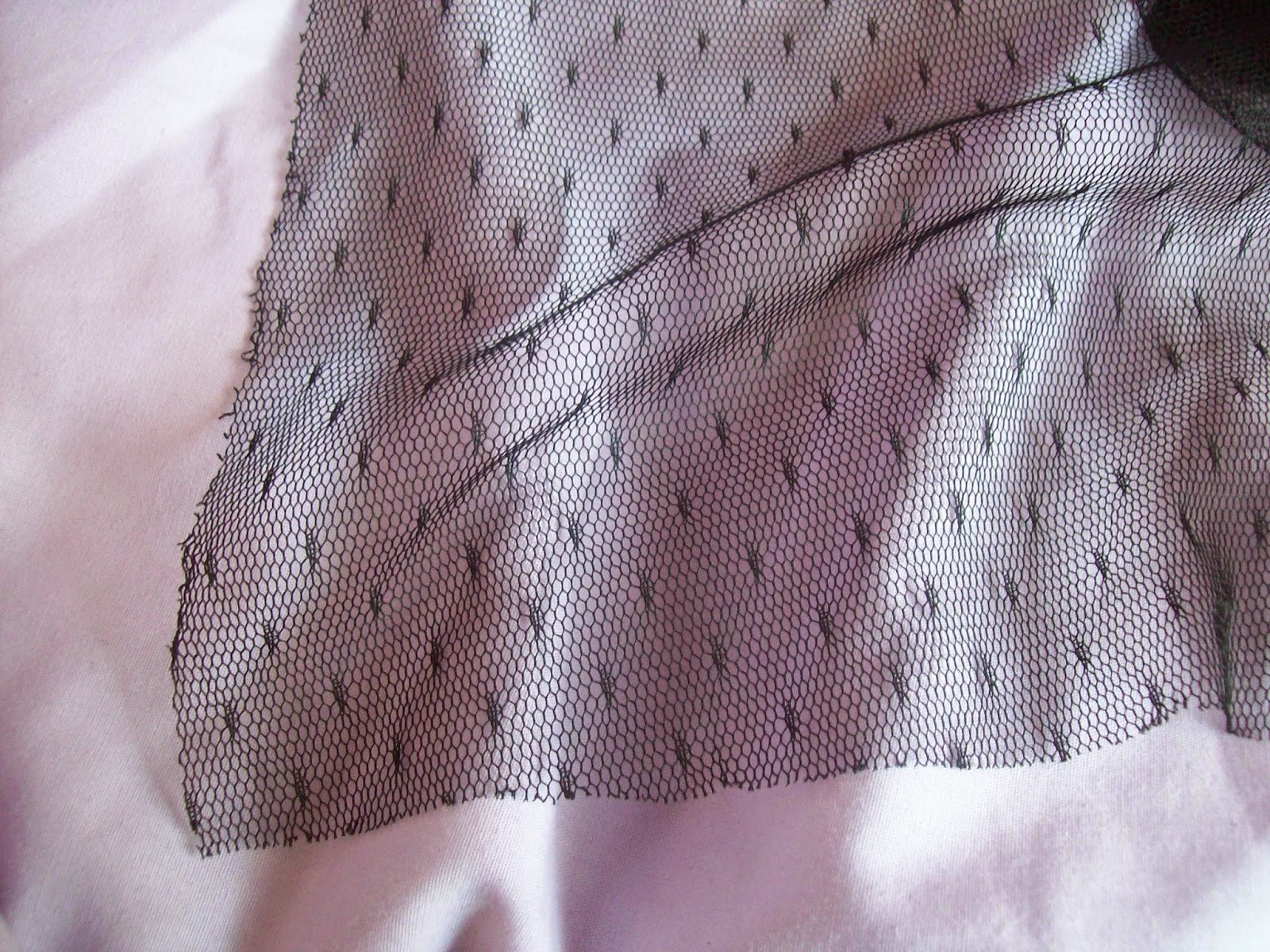
The veil part is made up of different types of cheap tulle. I quite like how it is a mixture of plainer looking tulle and then this dot tulle. My main complaint about the tulle is the ends haven't been finished properly. Then again, it isn't really that noticeable unless you are looking up close. Overall, I am quite impressed with the hat. I am most concerned with how I am going to keep it on my head.


The final item I got from Ciciwork is a pair of black gloves. The sizing was generally quite generous. I found the fingers are a bit long for me but I usually have this problem with gloves anyway. In this photo I had pushed the fingers all the way down, which is why the gloves look a bit baggy in this photo. The elasticated wrist fitted quite snugly. It gripped my wrist quite firmly so this may not be a good option for those who have bigger wrists, as it may become uncomfortable.


I feel the bows on the wrists could do with being a bit smaller in size. The bows are also quite sweet looking compared to the gothic looking gloves and perhaps the check ribbon wasn't the best choice. I think solid coloured ribbon would have been better here. The ribbon used is also a bit shiny. Aside from the size, the bow has a good shape to it. The black beads are a nice finishing touch.


Here is a better shot of the lace. I personally think the lace is pretty good. I have seen gloves made of much worse lace than this and for the cheap price you pay, you get decent materials. Also, the material feels very soft and it is lovely against my skin. It doesn't feel the slightest bit itchy, which you can get with some cheaper lace gloves. 

So overall, I feel like Ciciwork is a good option for cheap accessories. However, there is the odd thing here and there I would change. Perhaps in some cases, like the hat's veil being too heavy, the execution could have been a bit better planned out. You definitely do get what your money's worth though, and the gloves actually turned out better than I was expecting. Ciciwork is a good Taobao store for building up a collection of accessories for a low price. Just bear in mind that you do get what you pay for and if you are looking for quality, there are better options out there.

Finally, I ordered 2 cardigans from this Taobao store- Store Link Here Sadly, the cardigan design I ordered is no longer available but it is still worth a look. There are some very cute designs. At the moment I am especially fond of this cute Cat Cardigan 


The cardigans I got features some really cute moon embroidery and I had to have it! It is another one of those occasions where I was searching Taobao for something else and stumbled upon this by accident. I got the cardigan in navy blue and lavender. Both are really nice colours, although I like the navy blue a whole lot more. The lavender one reminds me of the colder lavender shade that Angelic Pretty has been using a lot more lately. The material feels super soft and when I tried it on I loved how it felt against my skin. It is quite a lightweight material, so this is definitely more of a Summer cardigan. It wont keep you very warm but is good for when you just need that tiny bit of extra warmth. Size-wise, it fitted me reasonably well. On top I am about a UK 8-10 with wide shoulders, and I had no trouble with doing the buttons up at all. The material is quite stretchy and I feel it could fit somebody slightly bigger than me. The arms were a decent length and the sleeves reached my wrists perfectly. The torso was a little bit short on me though, so it isn't tall friendly (I am only 5'4'' but I have a long torso). 


A close up of the embroidery. Yes, the moon does say "Fint" on it. I didn't realise until afterwards that it was a replica cardigan. However, I am really struggling to find the original cardigan online anywhere, let alone find one for sale. I am sure it must exist somewhere out there. The embroidery is generally quite neat. You can probably see there is something a bit wrong with the bottom star in the photo. If I remember rightly, it is just a loose thread. The lavender cardigan's embroidery was perfect with no faults at all. 


The buttons are covered with fabric, which gives them a softer appearance. It matches up with the white moon in the embroidery as well. The gold trim around the neckline, cuffs and bottom is a tiny bit itchy but bearable. There were a few small loose gold threads, but apart from that I could find no further faults with the cardigans. 

I am so happy with the cardigans and they are my favourite part of the order. The design is so cute. I do feel a bit bad, knowing it is a replica, but I didn't realise until they arrived. Despite searching, I couldn't find the original anywhere, so I don't know how it matches up quality-wise. But what I do know is that the cardigans I received are of a decent quality with minimal flaws. I am looking forward to wearing them once the worst of the Winter chill is over. I would definitely purchase cardigans from this Taobao store again.

Despite the odd little niggle here and there, there is nothing in this order that I am unhappy with. I think I got reasonable value for money and I would definitely use all of these Taobao shops again in the future. Hopefully at some point I will be able to review the final part of this Taobao order (it isn't looking promising) but that review is unlikely to be featured on here until January now. We will have to see how things progress!


Monday 1 December 2014

Story of the End of Ragnarok by Alice and the Pirates

Today I shall be taking a look at Story of the End of Ragnarok by Alice and the Pirates. This series includes 2 dresses, a skirt, 3 hair accessories, a blouse, tights, a choker and a necklace.


First up is the JSK. The bodice looks well fitted, although I am not so keen on the overall bodice shape. I really dislike the neckline. The dramatic shape is a bit harsh looking and although there is lace, the lace doesn't do much to soften it. The straps are a bit thin and I feel they could do with being a bit thicker. They are also a bit plain and I don't like the way the straps look teamed with the neckline. The dropped waist is topped with lace. Whilst I don't like the dropped waist, I think the lace is a pretty choice and it has a good shape to it. It sits nicely on the dress too. The bodice features 2 thin lines of lace, which give the bodice a panelled appearance. I like the idea, but I think the 2 lines of lace could do with being a bit further apart. Near the neckline, there is a little bit of a ribbon corset in the centre. The ribbon used is pretty and matches well. I wish they had made more of a feature of this though. The ribbon literally crosses over once and then that is it before it is tied in to a bow at the bottom. It hardly seems worth it being there. I would have let the ribbon carry on at least a little bit further down the bodice to make more of a feature out of it. The back has a panel of shirring which is concealed neatly by a ribbon corset. The stock photos show that the skirt has a lovely, subtle bell shape to it. It looks as though it will hold a reasonable amount of petticoat and flares outwards quite gently. This more subdued shape is a good choice for the dress theme and print. The skirt is kept simple and the print is displayed very well. The bottom hem is then finished off with a line of very pretty lace. I like the floral design they have picked.


This is the OP. The short bodice is a bit slouchy and baggy looking. This is probably partly due to how elasticated and stretchy the bodice is. It is good that the dress has a bit of size flexibility though. I find the neckline shape very unappealing. It is too basic looking and not an attractive shape. The lace that has been used along the neckline is pretty, but it looks out of place and doesn't combine well with the neckline shape. The sleeve shape is a bit odd too and in some stock photos, the elasticated ends stick out at an odd angle. I don't feel longer sleeves would look right with this dress so maybe smaller cap sleeves could have been an option? The high waist features a ribbon belt. The ribbon has the most beautiful design embroidered on it. I love the use of gold. Also, the belt pulls the slouchy design together, giving it more shape and a slightly smarter appearance. The skirt has plenty of length to it. It doesn't seem to flare out a great deal, but with this sort of dress shape you don't really want too much poof. There is still enough room to create the shape that we are seeing more frequently with classic lolita recently. The skirt design is kept simple and so the print is displayed brilliantly. At first I thought that the bodice on this dress was far too casual and simple looking, but now I think this is better, because the print really is the main focus on this dress. The bottom hem is finished off with pretty lace, which matches up with the neckline.


And here we have the print close up. This series is available in brown, bordeaux, green and black. Apart from the black, the colour choices are quite 'earthy' and they compliment the print so well. I think the brown is just about edging it as my favourite colour. As for the print itself, it has been drawn so beautifully. The print has captured the Norse mythology images well with the pictures inside the arches. Everything compliments each other. I especially like the tree picture in the middle. The colour inside the arches really pops against the main dress colours as well. The arches are very pretty and I like that there are people climbing on the arches and black birds perched amongst them. At first I found the non-border part of the print a bit dull, but now I think it offers a nice contrast. 


One of the hair accessories from this series is this pearl lariat. This is not something I have seen widely used in lolita before, but I do feel it is an interesting inclusion in this series. It is such a pretty idea and it does suit the theme of the print. I do worry that if I wore this though, it would instantly get tangled in my hair! Whilst this lariat may not work for a lot of lolita outfits, when it does work, it can look beautiful. I feel this is something I would quite like to see more of in lolita. However at Baby's retail price, I will be looking for cheaper alternatives!

So overall, I feel this series is an interesting idea. I like the use of Norse mythology and I think the style of the dresses and colour choices are good matches. There is the odd little niggle I have with both of the dress designs though. Would I buy this series? Probably not, but I shall be admiring it from afar. If I had to choose a dress I would go for the OP in brown. I predict that this series will have quite a few fans. I think this is going to be one of those series which wont be that hyped to begin with, but gains popularity a bit further down the line.

Thursday 27 November 2014

Oxford's Tea Party Club Calendar Meet

This year the Oxford group decided to take part in the Tea Party Club calendar again. We got given August as our assigned month again this time, which proved a challenge in a dreary, rainy Oxford in the middle of November. However, I think we did a much better job of hiding the Autumn leaves this time around.


This time our shoot theme was Marie Antoinette. I was torn between wearing Fancy Egg and Cinderella Jewellery for the photo shoot. In the end, I chose Fancy Egg because the lighter colours are a bit more Summery. It gave me the perfect excuse to wear my Stocking Shock tricorn hat. I teamed it with my blouse from The Floral Notebook. The sleeves are definitely too long on me and I had to choose between rolling them up slightly or letting them fall down and covering up my gloves and wrist accessories. Aside from blouse issues, the outfit came together okay. I found the perfect matching jewellery and the print on the dress fitted the theme really well. 


We decided on a couple of different locations for the photos. The problem with Oxford is that a lot of the buildings are small or tourist traps, so it is very difficult to fit our groups in places without causing a lot of havoc. So we stuck to outdoor locations. Lauren's sister very kindly agreed to take the photos. She was very patient with us, even when some of us wanted individual shots. 


When we were doing some of the smaller group photos that wont be used for the calender, I decided to try and coax this pigeon in to getting in the photos! And I was successful! Sammi and Shalisa didn't seem to mind.


We also went in to one of the colleges to take full advantage of the beautiful architecture we have here. I really liked this location and I hope we use one of these photos in the final calendar picture. When you live so close to Oxford and visit so frequently, sometimes it is easy to forget about the beautiful surroundings.


This picture is from the college garden. If we weren't so busy taking photos I would have loved to have taken a stroll around the gardens. All the leaves were such pretty colours. 


A close-up of my accessories. I am really getting in to gloves at the moment. They are a bit awkward when you are trying to use your phone or eat something though, so I have to keep taking them off!


Afterwards we went to Noodle Nation for food. Loads of places were full, but we did bump in to Bethanie and the food is tasty so I am glad we came here. This is the fortune I got in my fortune cookie. I have no idea what it means!

I am very confident we got a good picture this year and I can't wait to see them. I felt absolutely exhausted after the photos and I was recovering from another cold, but I am glad I made the effort to come. I just wish my tricorn didn't keep falling off during the photos!

Related Posts Plugin for WordPress, Blogger...